articles/Weddings/albumchallenge-page3
The Album Page Challenge - part 3 of 1 2 3
by Mike McNamee Published 01/06/2005

Tom Lee
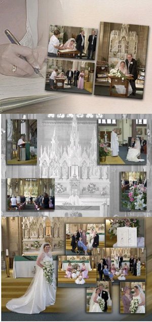
The desaturated and dropped back tone of the background makes the celebrant priest a feature without too much emphasis. The weights of the four images are balanced by the size and positioning. The top right image shows some of the typical clutter that wedding photographers have to contend with - the crooked music stand, bright blue lamp on the piano, the ever-present "emergency exit" sign.
Note how the quality of this hand-set is better. The motion blur concentrates the interest. All the images tell the story behind the signing of the register. The two sepia images are effective sub-paragraphs of the story and bring the composition across the page crease without the risk of impairing the image.
The bride shows off her train, facing inwards with her face roughly in the upper left third of the spread. The backdrop to the right is heavily motion blurred on the angle, colours matching by default. The story in the cluster of images is told by the picture selection.

Mike McNamee
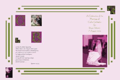
This is where the critical gloves can come off! I was seeking to explore the graphic design possibilities of using software other than Photoshop in order to approach the alum design from a more "graphics" angle. First port of call was Adobe Illustrator which was used to modify CorelDRAW initial capitals and flourishes by adding colours from the selected palette. We were seeking an Art Deco look so we used Bernhard Fashion as our font. However this was not suitable for the biblical text as it was too light and thin when used with the theme colours. We selected Cataneo BT and set the biblical quote using InDesign, to take advantage of the optical margin alignment. Swash capitals were added where appropriate. The text was then moved to Photoshop as an object, to preserve the text spacing. The borders were made using a Brush Set made by Miriam Lewis and available from the Adobe Studio web site
http://share.studio.adobe.com
Final Thoughts WeWedding Album 4 live in an ever-changing world! The initial concept for this article was for collaboration between a number of different people, using a variety of methods, including InDesign. It came to life after a presentation from Adobe's Chris Kitchener at the SWPP/BPPA Convention in January this year. The question he posed was how good (or better) InDesign might be as a method of making up album page designs. Since that time CS 2 has been launched and what do we find? Well you can drop a Photoshop file onto another Photoshop file just like you might in InDesign and on top of all that, the new Adobe Bridge offers a way of managing all types of digital assets and dragging them straight onto the page! We will be keeping a weather eye on that concept when, hopefully, we review the new CS suite. We are still a little paranoid about how long it is taking to fettle images ready for dropping into the album - a matter we will, no doubt, be returning to again and again. Here, Adobe Bridge seems to offer some relief with its slick RAW file handling and multi thread processing. First impressions are that Bridge is a bit slow on the uptake but once everything has been cached the benefits might outweigh other factors. The star rating of images on the virtual light box so that they can be sorted will assist the image selection process. Watch this space, and don't forget that we run a competition for folios - not quite the same thing but close!
Please Note:
There is more than one page for this Article.
You are currently on page 3 Contact Mike McNamee
1st Published 01/06/2005
last update 09/12/2022 14:50:59
More Weddings Articles
There are 0 days to get ready for The Society of Photographers Convention and Trade Show at The Novotel London West, Hammersmith ...
which starts on Wednesday 15th January 2025


