articles/Lighting/bordello-page1
Bordello Bride - part 1 of 1 2 3
by Dave Montizambert Published 01/12/2013

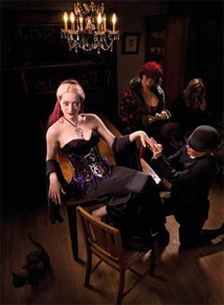
In wedding photography today, it seems that couples are opting to balance the traditional puritanical bride images with some rather edgy, trashy ones. I wanted to have a little fun with this by creating images that take this concept to the extreme by placing a bride in a bordello. I also pushed the boundaries of the wedding-dress by showcasing the wedding gowns of an alternative wedding dress designer, Ric Yeunn. This image (see Image 001) entitled Indecent Proposal, depicts a scene where the mischievous bride-to-be, played by model, Renee Robyn, erroneously accepts a marriage proposal from 'The Mark', a dubious character played by Kristen Jones, who thinks s/he has just purchased a bride from the madame of the bordello. Indecent Proposal was one of three images from a series that my wife, Sylvianne and I concocted after a few cocktails, we named the trilogy, Bordello Bride.
The three images, Stairway to Sin (seen in article Lighting For Digital Part 21), Indecent Proposal, and Parlour Room Tricks were part of an exhibition at a Vancouver gallery. Art galleries usually include a description of the artist's intention for the piece; this is good because it prepares the viewer's mind for the work and it also gives some perspective. Unfortunately all too often the description is full of empty 'art-speak' trying to convince us that what we are seeing is not mediocre, just that we are too stupid to understand it and so it must be great (my opinion). Of course I could not resist having a little fun with this and so, with the help of a fine-art photographer friend, Rich Reynolds, the following 'art-speak' description for the Bordello Bride trilogy was included with my images:
Wow!! I have to admit, I feel a little stupid after reading that, so I guess Indecent Proposal must be good!
David James Montizambert, circa undefinable. Bordello Bride The Camouflage of Disorder Bordello Bride is an organic outgrowth of the liberalised ennui of the wedding photography milieu.
With a studied yet jaundiced eye, the once fairytale wedding of pristine white has been run over by the gestalt of a reality TV Zeitgeist.
The artist juxtaposes his moral ambiguity with a schizo-frenetic society ricocheting between Puritanism and Dionysian debauchery.
The shock of the lusciously lit images render us oblivious to the distinction between bride/whore and groom/John, forcing us to reevaluate the relationship between the primal urges and the societally sanctioned sexual union of marriage.
I started the shot, as I always do, by placing the camera. It was positioned up high, in close to the action, in and around Renee (see diagram of Image 002), its zoom lens set to wide-angle. The camera's tripod sat at the edge of the opening from the living-room into the dining-room. The high angle and the mild distortion created by shooting close to Renee with a wideangle lens, helped to create a humorous look.
When photographing a bigger scene like this, the question is always, how do you create great lighting over such a large area? Do you set up a light from the front and let it wash over the whole scene? I usually think not because I dislike flat lighting, it lacks depth and drama and so light placement is really important to me. The use of the dining-room for this shot was generously provided by the aforementioned Kristen; when I saw this room I fell in love with the atmosphere it created, it was thematically perfect for a room in an early 1900s' bordello. To create a nice rich nighttime look to the room, controlling the chandelier ambient light was paramount - I exposed the chandelier primarily with my shutter speed, and the studio strobe lighting with aperture. This is best done by first deciding on aperture for DoF, then setting the shutter speed relative to this aperture setting, and finally adjusting the power setting on the strobes relative to this aperture setting to create the desired ratio - all this calculated using my trusty Sekonic flash-meter. The final exposure had the shutter speed set to under-expose the room by 5 f-stops at f 8 at 1⁄8 of a second, this was still bright enough to make the chandelier glow.
With the ambient light sorted I then concentrated on the strobe lighting. Renee is, of course, the main attraction in this image, and so gets her own main-light, a mono-block strobe fitted with a small Octabox light-bank with a directional soft-grid, this rig was placed on the camera left-side of Renee (see A of Image 002). The soft-grid narrowed the light-bank's wide 160˚ spread of light down to just 40˚; without it the room would start to become over lit. The power of this light, measured with an incident meter placed against Renee's face and with its dome pointed at the Octabox, was adjusted to correctly expose her flesh. While the grid focuses most of the light on Renee, it does allow some to spill past onto the face of Kristen's character 'The Mark' and a little bit on Sylvianne the madame and Pernilla Ahrnstedt the smoking 'lady of the night' in the background; this is perfect since they are secondary to Renee's character. The grid makes it possible to get a good exposure on Renee and a 1⁄2 stop under on Kristen at the same time using only one light. This main-light was originally intended just for Renee, but I found that if I feathered the light a little off Renee and aimed it more directly down onto Kristen, I would be able to light both with just that one light. Renee is closer to the light, but she is on the edge of its light path. You would think that Renee's close proximity would cause her to be a lot brighter than Kristen, but this is not the case; the grid makes the light fall off rapidly at the edges of the light path.
In this image, like most of my images, liberal use of back-lighting was employed to separate the subjects from their surroundings. This is a perfect lighting solution for an image that needs to look like evening - the fronts stay in shadow while the lit edges show form. To that end, a second monoblock strobe fitted with a tall strip light-bank and a soft-grid for direction control, was placed to camera left-side at the back of the photo-set just out of camera frame (see B of Image 002). The fabric grid reigned in this light-bank's 160˚ spatter of light to 30˚ horizontally and 50˚ vertically. This 30/50˚ mix allows the light to spread more on the vertical axis and less on the horizontal axis, making it perfect for edge lighting tall objects such as humans without spilling too much on the rest of the scene. The exposure for this light, read with the Sekonic meter set to incident and placed at the back edge of Renee, was adjusted to 1 1⁄2 stops below the camera setting. Notice the nice separation of Renee from the background, the table and chair from the floor, and how it also brings Kristen's face up a 1⁄2 stop so that it is fully exposed. Even the chandelier and Sylvianne benefit from this light-bank!
To separate the right side of everyone from their surroundings, a second back-light was clamped to the top of the cabinet on the camera-right side of the set. This mono-block strobe was fitted with a small Octabox light-bank and was pointed down directly onto Renee (see C of Image 002). To reduce the amount of light hitting the others, a black cloth was clamped to the bottom third of this light-bank (see D of Image 002). The exposure for this light, read with the Sekonic meter set to incident and placed at the back edge of Renee, was adjusted to one stop below the camera setting.
You are currently on page 1 Contact Dave Montizambert
1st Published 01/12/2013
last update 09/12/2022 14:51:51
More Lighting Articles
There are 0 days to get ready for The Society of Photographers Convention and Trade Show at The Novotel London West, Hammersmith ...
which starts on Wednesday 15th January 2025


