articles/Presentation/borders-page1
Imaging without borders! - part 1 of 1 2 3
by Mike McNamee Published 01/06/2013

This feature arose from a discussion at the Epson Print Academy. The author was demonstrating an Epson 3880 using Epson Traditional Photo Paper from the front loading slot and produced a print upon which the image was skewed on the A2 sheet. The delegates reported similar issues and so we decided to investigate further.

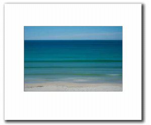
Artistically there is a view which says that fine art images should be presented with a broad border. This has the effect of adding richness to the print ('look I can afford to be on a large sheet of paper!') while also allowing space for the author to sign and number an edition, if that is required. We have seen this trend in the Societies' 16x20 competition to the extent that a minimum image area rule has been invoked. In this competition, images with three-inch borders are not uncommon with even larger borders to the base. There is nothing wrong with this approach, it undoubtedly attaches 'gravitas' to a print (as well as forcing the judges out of their chairs to take a closer look). By way of research we phoned Dave Davies, a Liverpool framer who specialises in high-quality art framing and posed the question, 'What size of borders do artists use on a 16x20 print?' Apparently Dave treats three inches all round as a standard minimum (31⁄2" base) but some of his artists ask for five inches all round.
There is an additional benefit to putting space around the live matter of an image.
If an image has a well-defined edge, at, say, 2mm from the window mount, then an error of just 1mm will look awful, as the error in the 'gap' is 50%; the same error with a 50mm border is 2%. This is also true of canvas prints with a large white space holding key line - any wavering of the canvas due to uneven stretching will look awful.
You are currently on page 1 Contact Mike McNamee
1st Published 01/06/2013
last update 09/12/2022 14:51:51
More Presentation Articles
There are 0 days to get ready for The Society of Photographers Convention and Trade Show at The Novotel London West, Hammersmith ...
which starts on Wednesday 15th January 2025


