articles/Printers/canonpixmapro1-page3
Canon Pixma Pro-1 - part 3 of 1 2 3
by Mike McNamee Published 01/02/2012

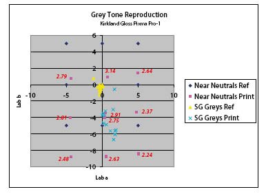
The analysis of the true greys and 'near neutrals' for Kirkland Gloss (a brightened paper). This explores the placement of the greys in the colour space. The yellow triangles show the greys of the Macbeth SG chart are close to neutral (the 0, 0 intersect of the graph). The base coolness of the paper has pulled the neutrals towards blue (the blue crosses) with the most blue reading being the paper white (at -9 on the b scale). The dark blue diamonds are the reference values of the near neutrals, arranged around the colour wheel. Note that the magenta squares, the print values, have been universally dragged downwards to match the base white of the paper - this is normal. The red values are the CII readings which are reasonably similar and indicate that there will be no adverse increases in metamerism if 'toned' images are created.

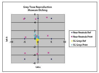
This the the same graph set as that above except that it is for Museum Etching paper which has a natural colour and no brighteners. The results show less movement as the base white is already very close to neutral. In a real print this would result in undistorted skin tones although the brightness of the paper is reduced and so the print would have less impact if viewed alongside Platinum Gloss.
SUMMARY
Overall the monochrome performance of the Pro-1 was excellent other than the rather dark rendering. This could be factored out in the driver with a little experimentation or the image could be reduced in density at the conversion to monochrome stage in Photoshop. This latter step is the least favourable as it is not transferable to other printing systems.
The use of bespoke profiles would, of course, remove the issue.
Please Note:
There is more than one page for this Article.
You are currently on page 3 Contact Mike McNamee
1st Published 01/02/2012
last update 09/12/2022 14:52:08
More Printers Articles
There are 0 days to get ready for The Society of Photographers Convention and Trade Show at The Novotel London West, Hammersmith ...
which starts on Wednesday 15th January 2025


