articles/Digital/colouradjust1-page4
Colour Adjustment - Part 1 - part 4 of 1 2 3 4
by Mike McNamee Published 01/10/2002
Initially we will concentrate on Lab colour. This is the underlying colour system used by Photoshop (regardless of what your image says it is in). Both a CMYK and an RGB image will be worked as Lab values in the background by Photoshop. When it comes to send the colour to your screen, Photoshop works out the voltages to apply to the red, green and blue electron guns at the back of your monitor. However, if you send the image to your printer, Photoshop works out how much cyan, magenta, yellow and black inks to spray onto the page. The fact that these two methods are so radically different is the source of much of the grief you get with imaging and reproduction. In Lab colour, the L value is the lightness, a is the red-greeness and b is the yellowblueness. Hence skin has Lab values of 66L, 14a and 15b. This indicates that the brightness is 2/3 of the way towards fully bright white (66% is almost 2/3 of 100%) and that the other predominant colours are red and yellow. Negative values of a indicate greens, negative values of b indicate blues. Hence a colour with values of zero for both a and b is a neutral grey, of a density determined by its Lightness value

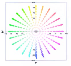
The Lab Plot. Pure Yellow is at the top, pure blue at the bottom. Green is to the left and red to the right. Also superimposed are the discrimination elipses. Note that they are small in the centre (easy to discriminate), large towards the pure colours and largest of all in the deep blues. The shape of the elipses indicates that the eye is more sensitive to changes in hue (colour) than to saturation.
In order to understand colour better, scientists plot the colour on a graph. This is like a map and just as you can measure how far two places are apart on a map, you can measure how much two colours are different on a graph. Just as you can look at a map and say Denbigh is west of Liverpool you can say that magenta is more towards a red than a cyan.
Colour AdjustmentCrucially, the eye's ability to judge colour varies depending upon what the colour is. You have a hard time deciding if a deep black has a blue bias or a green bias for example. It is easier to spot the difference between two reds than between two deep blues if they are different by the same amount (i.e. the same distance apart on the graph). Crucially, the eye is most sensitive when spotting the difference between light grey values. This is why you are rarely satisfied with your grey scale off a 6- colour printer. Not only does the printer have a hard time getting the colour right, your eye spots the errors with great ease!
Please Note:
There is more than one page for this Article.
You are currently on page 4
- Colour Adjustment - Part 1 page 1
- Colour Adjustment - Part 1 page 2
- Colour Adjustment - Part 1 page 3
- Colour Adjustment - Part 1 page 4
1st Published 01/10/2002
last update 09/12/2022 14:52:34
More Digital Articles
There are 0 days to get ready for The Society of Photographers Convention and Trade Show at The Novotel London West, Hammersmith ...
which starts on Wednesday 15th January 2025


