


articles/Lighting/cwl45bw-page2
by Dave Montizambert Published 01/04/2017
3
Notice how dark his flesh looks, yet we see his form and details perfectly due to the specular light-form wrapping his face and body. The placement of the light helps with this lighting effect too. I typically skim the light across the person to put them in shadow as much as possible – shadow is an underexposed area and so helps with the darkening of the flesh. In the case of image 001 the main source of illumination was light bouncing off two sheets of A4-size office printer paper directly below Michael’s face, (see lighting diagram in image 002). This skimmed light projects big juicy shadows across his face and body. These shadows I barely fill in so that they are dark (high shadow contrast in tech-speak), this further enhances the dark-flesh effect. In Lightroom or in Adobe Camera Raw processing software, I often push this effect further with the “Black & White Mix” or “HSL/Grayscale” luminance sliders to darken Reds, Oranges, and Yellows (the colours that flesh-tone is made up of), which effectively darkens the flesh-tone with little effect on specular sheen.
4
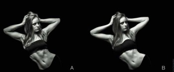
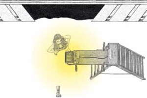
Different Raw processing settings can really affect the feel of the image; case in point, see image 003 of two versions of the same image of aerialist Loretta Hope which I created during a workshop on minimalists' approach to lighting in London at the Societies’ Convention a couple of years ago. The A version used process settings such as those used in image 001 of the kick-boxer Michael to create a hard feel, whereas version B, I set the “Black & White Mix” sliders in Lightroom to lighten the Reds, Oranges, and Yellows to mimic shooting B&W film with a red filter over the lens. This really lightens the red colour range that makes up flesh and creates a soft B&W feel to the image with a bit of a glow. Which one is best? That is totally subjective, I love both, each creates a different mood. Lighting for this image was very simple (see lighting diagram Image 004), a 500 watt workman’s tungsten light attached to a makeshift stand (a step-ladder) was bounced off the white ceiling above Loretta.
I’d like to finish off by saying that I absolutely love B&W; perhaps it is its simplicity over colour – there is no colour contrast to distract us, only tonal contrast to consider. Or perhaps that it has such potential for creating drama, something I strive for in my images and not in my life:).
There are 0 days to get ready for The Society of Photographers Convention and Trade Show at The Novotel London West, Hammersmith ...
which starts on Wednesday 15th January 2025


SWPP - Society of Wedding and Portrait Photographers
The Society of Photographers
Clwyd Chambers, Clwyd Street, Rhyl, Denbighshire, LL18 3LA, UK
Tel 00 44 (0) 1745 356935
Home Page - Find a Photographer - Benefits of Membership - Events and Seminars - Who's who - Photographic Trade Directory - About - Qualification Structure - Mentor Me Programme - Professional Imagemaker Magazine Articles - FREE information pack - Privacy