articles/Printers/epson4800-page2
Epson Stylus Pro 4900 - part 2 of 1 2 3
by Mike McNamee Published 01/02/2011

We performed a nozzle check and an auto-alignment of the heads, again this was trivially simple (note that the nozzle check is available under the ink change button).
Audit Testing
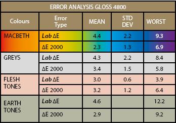
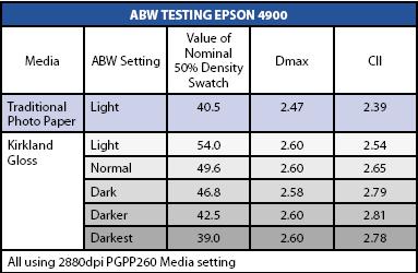
As might be expected when you give a colour geek a new printer with both new features and ink set, it sets off a frenzy of testing. We only managed to scratch the surface before we went to press and will undoubtedly return to the topic in the next few issues. Initially we chose to use Epson Standard Proofing Paper. This is a premium-quality, Fogra-certified media, normally reserved for contract proofing work. We conducted tests using generic profiles and also made bespoke profiles, which were also tuned.
We were able to explore the ink set capabilities without making any prints by using the available profiles. The VMHD inks show the highest gamut we have measured to date with the gamut volumes for Premium Luster, Premium Photo Gloss and Standard Proofing Paper all passing the 1 million Lab3 mark. To put that into perspective we compared the capabilities of the papers against the Pantone GOE Coated swatch set and used BabelColor's Patch Tool to assess the gamut. We were then able to conduct statistical analysis, as well as overlaying the data for a graphical comparison.

The Pantone GOE colour set consists of 2,058 colours, many of which cannot be reproduced by ink-on-paper printing presses, they are out of gamut. In order to accurately proof Pantones the proofer ink set must have sufficient gamut to cover the Pantone values (colour co-ordinates). We have been using the methods described here for about a year now, but have not yet published anything. The data shows that if you set a limit of 2?00 as the required accuracy then 54 Pantones are out of gamut. If you relax that tolerance to 3?00 then just 11 Pantones fall outside of gamut. Even this only tells part of the story because of the 11 out-of-gamut Pantones, nine are deep purple-blacks and only a yellow and a red are 'bright' colours (with errors of 3.20 and 3.25). The bottom line then is that with just a couple of exceptions, the VMHD ink set is the best ever tested, can cover a massive percentage of the Pantone colours and in the cyan area of the gamut it exceeds the values of the Pantones. The weakest area of VMHD is in the oranges as shown by the scatter graph.
You should not assume that the high levels of precision indicated by the gamut clipping test will translate seamlessly into similar values in actual print-making and proofing. Other variables come into play such as the linearisation, close-loop calibration, along with paper variations, temperature and humidity variations.
If we compare similar data from the 4900, 3880 and 3800 it indicates a gradual improvement from the K3UltraChrome ink set through the Vivid Magenta inks to the latest Vivid Magenta HD. The improvement is all round, with almost every statistical parameter showing a gain. The VMHD is almost universally best in class.
The implications of all this analysis is that the user can expect more vibrant colours in reproduction, particularly for fine art work where a higher number of artists' pigments will fall within gamut. If you reproduce fine art for money you can usefully exploit the data as a USP for your services!
Please Note:
There is more than one page for this Article.
You are currently on page 2 Contact Mike McNamee
1st Published 01/02/2011
last update 09/12/2022 14:53:54
More Printers Articles
There are 0 days to get ready for The Society of Photographers Convention and Trade Show at The Novotel London West, Hammersmith ...
which starts on Wednesday 15th January 2025


