articles/Review/epsonstyluspro4880-page1
EPSON Stylus Pro 4880 - part 1 of 1 2 3 4
by Mike McNamee Published 01/12/2007

EPSON Stylus Pro 4880 and UltraChrome K3 Vivid Magenta
This is an upgrade to the Epson 4800, the improvements being in the print head and the new K3 Vivid Magenta ink set. Although we were able to operate the new Epson 11880 at its launch, this is the first time we have had the opportunity to really put the new ink set through its paces. Claims are made for an increased gamut and a significant speed increase in the new machine, both were substantiated in our tests.
Set Up
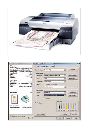
This was straightforward even though we were using 'beta' drivers. The print interface is improved with more detail in the side panel telling you how you are about to print. This is reassuring when you have large, expensive pieces of high-quality paper about to set off!
In the new, 'select settings' drop-down there are defaults for Photo High Quality, Proofing, Posters, and 2 page N-up booklet printing. The last of these may be used to create ready-to-fold booklets, effectively a simple imposition programme. The 'printable area' (ie Standard, Centred or Maximum) is now tucked away behind its own button.
There are 25 media selections available. Canvas is not one of them so we assume that it is not strictly recommended for use in this printer. There are no changes to the Advanced Black and White dialogue box.

There are two new inks, Vivid Magenta and Vivid Light Magenta. They are formulated with increased saturation, which moves the gamut boundary further out into the colour space. Magenta is used to make magentas (obviously!), reds (with yellow) and blues (with cyan) and so a more vivid offering might be expected to increase the saturation in these secondary colours as well. The one thing that the 4880 does not do is provide fast change between Matte and Photo Black inks, this is an area where the 3800 has the edge (even without Vivid Magenta) and has been particularly welcomed in the larger 11880.
The Colour Gamut
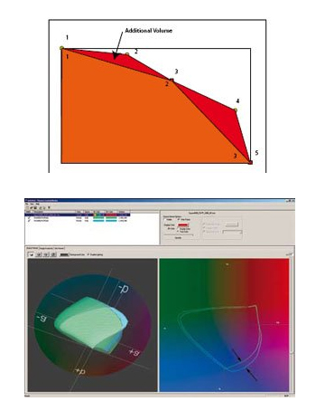
It is possible to use complex mathematics to calculated the size of the gamut (its volume) - this is not the same as the number of colours (the bit depth) and it should be recognised that a doubling of gamut volume (as happenes between say a matte art paper and a gloss paper) is not a doubling of visual quality; the eye accommodates the lack of depth in the colours to some extent. However, for proofing work, and particularly contract proofing, the ability to achieve a colour may be important, as it will be measured should there be any dispute on colour fidelity.
The screen grab illustrates a like-for-like comparison of the gamuts of the 4800 and the 4880 (both samples on Epson Premium Luster 260). The extra gamut (arrowed) is present at all lightness levels as partly illustrated by the 3-D representation on the left. As shown left, the precision of the gamut has an effect upon the measured volume - you need to know the swatch numbers!
You are currently on page 1
- EPSON Stylus Pro 4880 page 1
- EPSON Stylus Pro 4880 page 2
- EPSON Stylus Pro 4880 page 3
- EPSON Stylus Pro 4880 page 4
1st Published 01/12/2007
last update 09/12/2022 14:54:00
More Review Articles
There are 0 days to get ready for The Society of Photographers Convention and Trade Show at The Novotel London West, Hammersmith ...
which starts on Wednesday 15th January 2025


