articles/Paper/fiba-page1
Paper Chase Innova Fiba Print Warm Cotton Gloss - part 1 of 1 2 3
by Mike McNamee Published 01/08/2012

Base Properties
The paper is a natural cream but nevertheless quite close to perfectly neutral. It has a calliper of 420 microns. The base is a 100% cotton fibre substrate which gives the paper quite a soft feel especially compared to an alpha cellulose base. The paper 'whiteness' properties are listed in the audit table. It is one of the warmer offerings in the Innova range without being too creamy. The OBA activity is zero both in the viewing booth and under the spectro. The surface finish is a medium gloss with just a hint of paper texture, very akin to a traditional air-dried fibre based silver halide material.
It was resistant to normal wear and tear scratching and actually quite tough under the less scientific test of dragging a finger-nail across it!
Colour Audit
Profiles are available from the Innova website. We tested both with the generic profile and a bespoke one we made ourselves. Both produced excellent audit statistics, amongst the best around. This was no real surprise, our experience with the Innova range of natural tone papers has always been high audit accuracy - it is a characteristic of OBA-free, baryta-like media.
The gamut was large at 1,071,402 units. The Dmax was 2.30 and the colour inconstancy index was 1.66 (ΔE00 D65 to Tungsten A at 50% grey). All of these are excellent results.
The audit data are tabled. The result of 2.42 ΔE00 for a generic profile is first-class, our own profile data of 1.74ΔE00 was even better! This is good shooting by any standard. The high gamut colours were well reproduced, the weakest was the yellow green, the strongest the magenta (which was less than 1ΔE00).

For all practical purposes these are flawless statistics and they fell just a little short of Fogra proof certification class (on the max error and some of the greys).
Monochrome
A paper such as this will find favour with enthusiast monochrome workers and fine art printers.
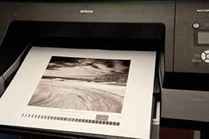
We printed monochromes using an Epson 4900 and the ABW driver, using Neutral/Dark settings. The delivered print was just 0.7% too dark and so the Dark setting looks optimum for tone density. The mid-grey was rendered neutral (just 3/10 of a point away indeed). The Dmax was high at 2.50 and the CII had drifted up to 2.59ΔE00. Tonal separation was good. No gloss differential was detected in either colour or monochrome prints. Overall the monochrome print quality would be rated as excellent.
A paper such as this looks even more handsome with a warmer rendering from the ABW driver. We set the ABW driver to 15 Horizontal and 20 Vertical, a little warmer than the default 'Warm' setting but about half of the 'Sepia' setting. The resulting print was moderately warm-toned like a well-made Record Rapid print. The data are collated:
The warm print was 2.6% too dark and so a setting of 'Normal' would be more appropriate (this would probably lower the Dmax slightly also). Such settings are, of course,
only the starting point for well-made fine art monochromes,
most printers would refine the tones' density and colour yet further.
You are currently on page 1
- Paper Chase Innova Fiba Print Warm Cotton Gloss page 1
- Paper Chase Innova Fiba Print Warm Cotton Gloss page 2
- Paper Chase Innova Fiba Print Warm Cotton Gloss page 3
1st Published 01/08/2012
last update 09/12/2022 14:54:10
More Paper Articles
There are 0 days to get ready for The Society of Photographers Convention and Trade Show at The Novotel London West, Hammersmith ...
which starts on Wednesday 15th January 2025


