articles/Lighting/filllight-page4
What, No Fill Light? - part 4 of 1 2 3 4 5 6
Published 01/04/2010

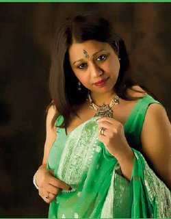
Image No. 7, is of a totally different subject, much darker skinned, almost black hair and adorned in a beautiful sari and decorative accessories, but the lighting set is unchanged from that used for Laura. The challenge for the form light is that we retained the same low key, deep-tone backdrop, but needed to create adequate separation - and it did. This time the model was Veena, ethnically Indian and very recently a first time grandmother to twin girls.
The trap of lighting the hair too brightly was avoided, so the natural hair colour was retained. When we light hair too brightly we are likely to change its colour. Hopefully when it is reproduced in the magazine, or newsletter for your review, it will show adequately.
The lights available at these sessions did not allow for a background light, so the separation is not as well rendered, as we would wish.
The form light has rendered Veena's figure in delicate subdued tones so as to correctly represent her natural colour. Note how the form light has sharply sculptured Veena's features and created a gentle butterfly pattern below her nose. Note also how the light from behind has created a sense of depth on her left arm and hand with both highlights and shadows.
When equipped with egg-crates or grids there is even more control. The light on the boom is also a strip bank and I use it either across the plane of the camera or vertically to the camera, depending on the coverage I need. In fact all four lights are strip-banks and, other than the light on the boom, are employed vertically. (See Diagram.)
This lighting set illuminates the subject with a depth that would be compromised if a fill light were used. It also creates a virtual rim light in certain poses, depending on the subject's attire, skin tone, etc, and the angle of view. Another advantage of this lighting set is that we are able to eliminate the light closest to the camera and create a nicelysculptured profile image. Additionally when seeking to be a little more creative we can turn the subject away from the form light and create an interesting alternative profile. Some may argue this is against all the conventional rules, especially in competition entries. But my argument is that lighting concepts and patterns are a matter of emotion and what excites us is a matter of taste. What many will regard as wrong-minded others may see as appealing.

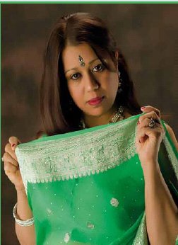
In image No. 8, though similar to number 7, is a tighter view and a slightly different angle of view with her head more vertically facing the camera, which slightly changes the lighting pattern. We also have Veena a little closer to the camera, which also changes the lighting pattern, resulting in a shallower ratio.
The four-light set again creates all around illumination.
This leaves the light numbered 2 in the diagram, which is positioned, almost 45 degrees behind the subject or 90 degrees from the camera, the most effective technique for creating profiles with depth. The lighting set shown in the diagram breaks with traditional portrait lighting styles. Not only does it not use a fill light the modifiers are all strip banks, generally 12x36'', sometimes 12x48'' when full-figure images are created.
Those used in the images shown here were double-diffused and did not have either egg -crates or grid accessories, which have been desirable, as there would have even greater control.
Please Note:
There is more than one page for this Article.
You are currently on page 4
- What, No Fill Light? page 1
- What, No Fill Light? page 2
- What, No Fill Light? page 3
- What, No Fill Light? page 4
- What, No Fill Light? page 5
- What, No Fill Light? page 6
1st Published 01/04/2010
last update 09/12/2022 14:54:13
More Lighting Articles
There are 0 days to get ready for The Society of Photographers Convention and Trade Show at The Novotel London West, Hammersmith ...
which starts on Wednesday 15th January 2025


