articles/Paper/fotospeednaturalsoft-page3
Paper Chase - Fotospeed Natural Soft Textured Bright White - part 3 of 1 2 3
by Mike McNamee Published 01/06/2012

Monochrome
We tested each paper using an Epson 4900 and the Epson Advanced Black and White driver. The settings employed initially were VFAP, 2880dpi, Neutral and Dark. The collated data were as follows:
Note the improved metameric index compared with the 'full colour' prints. All the mid-tone print values were too light using the 'Dark' setting and so an additional print was made using 'Darker'. This had the anticipated effect of around 4% shift and would seem more appropriate for our printer (it is worth experimenting with your own set-up).

fotospeed, paper, printers
Technically there was little to choose between the mono images, all were excellent - you pays your money and takes your choice. The brightened papers do add a cool punch to the monochromes, but some enthusiasts will not entertain OBAs in their fine art prints.
Real Prints
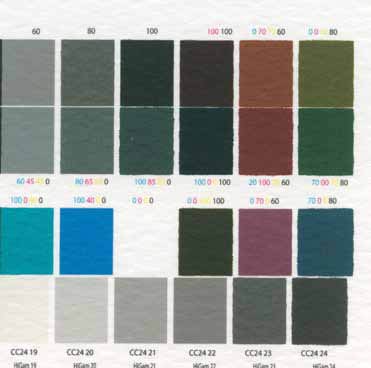
We made a small number of prints. One noticeable thing was that the texture of the NTBW, NST and NT 'shone through' the ink, particularly in the green tones. It is normal and acceptable that the character of the paper surface should be present in the lighter parts of an image on an art paper but the difference across the gamut was puzzling. It was not present on the NSTBW variant. We also noted that the edges of solid blocks of colour went wavy at the transitions gap. This is presumably due to the absorbency of the paper, but it was noticeably worse on the darker colours as though the paper was reaching saturation point in terms of ink flooding. Only on the NST did this effect show in ABW driver prints.
Please Note:
There is more than one page for this Article.
You are currently on page 3
- Paper Chase - Fotospeed Natural Soft Textured Bright White page 1
- Paper Chase - Fotospeed Natural Soft Textured Bright White page 2
- Paper Chase - Fotospeed Natural Soft Textured Bright White page 3
1st Published 01/06/2012
last update 09/12/2022 14:54:23
More Paper Articles
There are 0 days to get ready for The Society of Photographers Convention and Trade Show at The Novotel London West, Hammersmith ...
which starts on Wednesday 15th January 2025


