articles/Portraiture/kiss-page1
The KISS Principle - part 1 of 1
by Tom Lee Published 01/12/1999

In an effort to provide additional products/services offered by K C Photographic, I am experimenting with the promotion of "Fantasy Portraiture" I believe this is a relatively untried market, but the inclusion of Photoshop in the Social Photographers armoury, makes it an exciting prospect.
I am often asked "how difficult is it to produce photo montages?' Whether it is for wedding, portrait or personal work, I always advocate the K.I.S.S. principal Keep It Simple Stupid! or Too much manipulation is bad for your image!
Whilst at first glance the image may look complicated with three, four or even several separate images contained in the final result, the work process is the same for each element. The secret is to work methodically and in the same order on each element, and build up your image (with the elements on separate layers) as you go. However, successful images pay attention to detail such as the direction of the light falling on each of the elements.
It's no good having light from the left, on a part of the picture when the light on the part next to it is on the right!
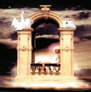
If we look at the picture in this article, it is made up of four separate elements'.
- The background
- The girl on the balcony window
- Two swan images o The wispy cloud effect at the base of the balcony
The concept of the image was to make the sitter appear like an angel suspended in the clouds. If we take each element in turn, the simplicity of how the final image was formed will be self-evident.
Note!- It is not intended to describe in detail how to use specific Photoshop tools. (Learning is an ongoing process, and I still don't know it all). Good instruction can be obtained by attending a course run by one of our members - Barn'e Thomas FSWPP, who is well known for his expertise in this field. (See last issue of "The Society Photographer" for course details)
1 The background - this was a straight skyscape taken early in the morning with a warm colour adjustment added (red and yellow in the midtones) to enhance the overall colour. The contrast was also increased to give more definition to the clouds. Don't forget to save your image at regular intervals. File sizes of multi-layered images can get quite big, and you don't want to lose your work after the hard graft you put in.
2 The girl on the balcony ' was "cut and pasted" from a larger image, with only the information necessary to give the required "feel" to the image, placed on a new, separate layer of the file. Doing this allows you to work on either the background or the balcony scene without affecting other elements on separate layers. Think of it as being two sheets of paper, one on top of the other. The image (after tidying up) was scaled to the size I wanted, without changing anything in the background. The image was then adjusted for colour, brightness and contrast until it matched my background scene.
3 The swans - were given the same treatment as the balcony scene. Although they came from two separate images, they were placed and positioned on the same new layer together. This layer is a separate one from the previous two. (A third sheet of paper!)
4 Wispy clouds - were created on another new layer, but this time they were made by selecting a suitable colour from the background layer using the eyedropper tool, selecting a soft brush from the pallet and painting in "soft light" mode, rather than importing another image. This was done to hide some of the hard edges formed by the boundaries of images on the layers underneath.
A final touch was added by creating a halo around the girl's head. This was formed using the "lens flare" filter and applied to the background layer. Simple, wasn't it!
The basic elements for simple montaging are therefore:
- Cut and Paste
- Scale (size your image)
- Adjust colour brightness and contrast o Minimal use of filters Don't forget that there is no one "correct" way to compile, create or manipulate your images.
The method described above will suit less experienced exponents of Photoshop and is merely the way I tackle the problem, and a matter of good practice. More experienced workers will no doubt have their own way of dealing with image composition. You should always use the method that works best for you, but above all K.I.S.S.
You are currently on page 1 Contact Tom Lee
1st Published 01/12/1999
last update 09/12/2022 14:55:33
More Portraiture Articles
There are 0 days to get ready for The Society of Photographers Convention and Trade Show at The Novotel London West, Hammersmith ...
which starts on Wednesday 15th January 2025


