


articles/Paper/lavaartpaper-page2
by Mike McNamee Published
Colour Values of Printed Samples
Epson 7600 Bespoke profiled for PhotoBlack*
Like other fine art papers there is a relative degrading of the black density compared to a gloss or lustre paper. The deepest black using Photo Black ink was 26% (brightness value). Across the gamut, the lightness error predominates in the darker tones.The black density and tone contrast is similar to Somerset Velvet Enhanced; both are lighter in tone than Permajet Classic Portrait and Hahnemuhle Photo Rag.The average error in the Macbeth Chart was 8.9 Lab.The De2000 error was 6.40.These data are about twice that which would be expected from satin or gloss materials or non-art matte materials. Within the average error of 6.40, the contribution from the lightness channel was 5.5, twice that of the hue and saturation.
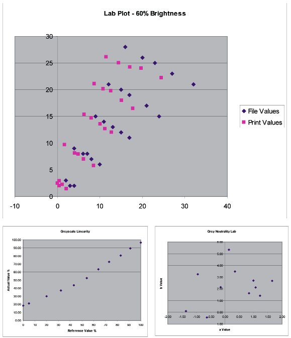
The skin tones had a mean error of 3.70, lower than the average for the gamut because the lighter tone errors were less affected by the lack of density. The flesh tones were the correct saturation but the hue was rotated a few degrees towards yellow. This tone bias was probably affected by the warm cream colour of the base material.
The greys were warm, in keeping with the base colour and they looked neutral to the eye.
There are 0 days to get ready for The Society of Photographers Convention and Trade Show at The Novotel London West, Hammersmith ...
which starts on Wednesday 15th January 2025


SWPP - Society of Wedding and Portrait Photographers
The Society of Photographers
Clwyd Chambers, Clwyd Street, Rhyl, Denbighshire, LL18 3LA, UK
Tel 00 44 (0) 1745 356935
Home Page - Find a Photographer - Benefits of Membership - Events and Seminars - Who's who - Photographic Trade Directory - About - Qualification Structure - Mentor Me Programme - Professional Imagemaker Magazine Articles - FREE information pack - Privacy