articles/Lighting/lightwahtlight-page2
Light! What Light? - part 2 of 1 2 3
Published 01/04/2007

The only justification for creating images with a lock down lighting set that never moves is that the practitioner has not learned to 'see' light. As a result he or she does not manipulate the lights for fear of producing an unacceptable image or as one student related, "In case I screw up". Yet, the most important aspect of lighting technique is that what we create represents what excites our visual senses. When we do not excite our visual senses we fail to be unique and become mundane, mediocre or both.
I return to the event at the college, related previously. To educate my students I implemented a process where each was required to know what each light available would contribute to the required result. In other words they needed to 'see' light. It took some weeks before any one of them was able to create a professionally lit image, partly due to the impatience of youth and the desire to get ahead of themselves and produce images, before they learned the process of creating lighting sets designed to obtain a specific result. What is disconcerting is that too many portrait photographers are of the same mindset.
At each of my workshops and seminars that deal with light, I preach and demonstrate techniques that enable delegates to see light and not assume that a given light set is the ultimate answer to their needs. I want my students and delegates to approach lighting with a different perspective than that which they had before.
There is a very important reason for this approach. Each one of us sees images with a different eye and appreciation. We are all individual with varying tastes and sensibilities. No two of us see images exactly the same way and when we create images we need them to represent our unique approach, to our work. If we do not do so, we become clones of each other and, in the market-place, when this happens, the difference is only the price or the individual personality, salesmanship of the practitioner and their client service. Additionally, if we do not seek to be different to our colleague down the street, we are missing the opportunity to provide potential clients with images that excite them too. So it is not about just being better, it's about being different. If you doubt this aspect of image creation just look at the fine art and fashion markets and see the incredible diversity of taste that is catered for.
In the following discussion I hope to show that there is a wonderful opportunity to create images that are uniquely different simply by seeing light and what it affords us and then to use it to create images that we have pre-visualised.
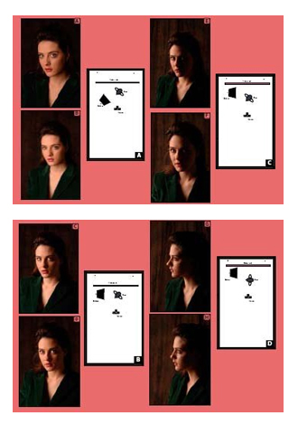
To illustrate the concept of seeing light, we examine the effects we can achieve with just one light. In the following illustrations 'A' through 'F', our subject is positioned so that she is presenting a three-quarter face to the camera. In each illustration the soft-box used is positioned so that the top of the box lights not only the face of the subject but also the hair. This requires the top edge of the box to be 8" - 10" above the height of the subject and tilted10 degrees toward the subject.
A matching diagram accompanies each image example.
In 'Illustration A', the light is an FJ Westcott 28" x 40" soft box that has just one diffusing screen (scrim). With just one diffusing screen, the light, though softened, is still a little specular.
The soft box is positioned at 45 degrees from both camera and subject. The first thing we note is that the light does not wrap around the subject as much as it does in 'Illustration B', which has a second diffusing screen while in the same position. 'Diagram [A]'
Essentially what will happen when we place a diffusing screen in front of the light source is the light scatters or, if you prefer, it is slowed down and enables it to wrap around. The more we scatter the light the slower is travels to the subject and wraps around a little more. We could compare this to driving around corners at different speeds. The faster we go, the greater the difficulty in turning corners - at excessive speeds, maybe we will not make it.
In 'Illustration C', the soft box, with one diffuser, is positioned parallel with both subject and camera. Immediately, we are able to see that there is a longer ratio between highlight and shadow than in 'Illustration D', in which we have placed a second diffuser. 'Diagram [B]'
In 'Illustration E', the soft box, with one diffuser, is positioned at the same parallel to the subject and camera, but behind the subject. This is designed to produce a dramatic split-light* impression, with a long ratio between highlight and shadow. Now see the difference when we use two diffusers in 'Illustration F'. 'Diagram [C]'. *A split-light describes any facial portrait that is lit on one side of the face and virtually or completely in shadow on the other side.
Please Note:
There is more than one page for this Article.
You are currently on page 2
1st Published 01/04/2007
last update 09/12/2022 14:56:01
More Lighting Articles
There are 0 days to get ready for The Society of Photographers Convention and Trade Show at The Novotel London West, Hammersmith ...
which starts on Wednesday 15th January 2025


