articles/Business/look-insp-page7
Look for Inspiration - part 7 of 1 2 3 4 5 6 7 8
by Mike McNamee Published 01/08/2016

Let's look at the evolution of a real-world example. The brief was to design a poster for a Rotary Club event. It was required in both printed (A4) form and also for electronic delivery. The obvious solution was to use PDF so that it could be purposed for print, smart phone, tablet, laptop and desktop computer use. The most significant advantages of PDF are its scalability and the ability to embed hyperlinks so that one click would (in this example) reveal the viewer's email application, auto-addressed for an RSVP and another click would deliver the map and directions to the venue, via the venue's website. The requirements of a poster such as this are almost universal and therefore worth listing to prevent you sending out an invitation lacking the time, or date, or venue or some other vital information (yes it happens quite a lot!).
GENERIC POSTER REQUIREMENTS
Place
Date
Time (start and finish if appropriate)
Venue (including Sat Nav directions)
Entry Cost (concessions?)
Event Title
Contact Info
Website Address
email Address
Telephone Contacts
RSVP Instructions
Organisation's Logo
Sponsor Logo(s)
In Aid Of?
URL Links for Interactive PDFs
Sat Nav and or Map
Legal Stuff (if required)
The theme of the event was a Retro Games Night which triggered thoughts of Bernie Inns, Watney's Red Barrel, Chotta Kegs, Party Sevens, Black Forest Gateau, schooners of sherry, steak diane's and the like - oh boy we were sophisticated back then! Games on offer were to be Ludo, Snakes and Ladders, Splat the Rat and Tiddly Winks. All of the foregoing words and possibilities failed to provoke any prolonged inspiration and quite quickly the notion of using the Bauhaus as a model started to gel. This, of course, harks back to prior knowledge, the Bauhaus and Art Deco saw something of a resurgence in the 70s and we also studied the graphics for the Gatsby feature in the last issue!
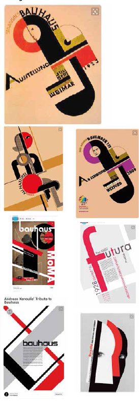
A search for 'Bauhaus designs' on Google soon yielded images and a picture was slowly built up of that defining characteristic which would be to give the correct look to the design. We migrated to Behance and Pinterest to gather further ideas. The iconic Bauhaus poster design is shown on the top right and we found 11 variations of it on the Google image set and 14 on Behance.
The outline characteristics of Bauhaus are as follows:
1. Use of vertical, horizontal and 45° orientations of lines and rectangles of various widths.
2. Frequent use of a colour theme consisting of black, red, white and dark brown sometimes with a backdrop of off-white paper which was sometimes also crumpled. All colours are solid blocks with no gradients or drop shadows.
Please Note:
There is more than one page for this Article.
You are currently on page 7
- Look for Inspiration page 1
- Look for Inspiration page 2
- Look for Inspiration page 3
- Look for Inspiration page 4
- Look for Inspiration page 5
- Look for Inspiration page 6
- Look for Inspiration page 7
- Look for Inspiration page 8
1st Published 01/08/2016
last update 09/12/2022 14:56:06
More Business Articles
There are 0 days to get ready for The Society of Photographers Convention and Trade Show at The Novotel London West, Hammersmith ...
which starts on Wednesday 15th January 2025


