articles/Portraiture/lowkeyportraiture-page5
Thoughts on low key portraiture - part 5 of 1 2 3 4 5 6 7
Published 01/06/2004

DAVE NEWMAN - lighting ratio
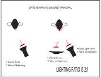
The Newman Baloney Principle At his recent UK seminars, Dave Newman used the following metaphor to illuminate lighting ratios. We have anglicised it and hope it will be as clear as his presentation!
Imagine that when a flash gun goes off it fires a slice of baloney at the sitter. Here is the first Anglicisation, for baloney read Spam - Spam as off the deli counter at Sainsbury's , not from Internet Explorer. This slice lands on the sitter's face and provides 1-stop of light upon the side of the face that it lands on. Imagine that this is the main light and the slice is worth f8 of light. Now you fire a slice of Spam from the fill light. This light is wider and place towards the shadow side of the face. The slice of Spam lands on the sitter's face but covers both the cheeks on the shadow and lit sides of the face. Now our unfortunate model has a double thickness of Spam on the main light side and a single thickness on the shadow side. The lighting ratio is thus 2:1 (two slices on one side and one slice on the other). Dave neman Lighting
Imagining stops of light in this way makes it easier to understand. If you now imagine that you make the main light one stop stronger it will fire 2 slices of Spam while the fill light will remain at one slice. Thus the ratio is 3:1 as the main side gets 2+1 slices and the shadow side gets 1 slice. If the main light is strengthened by a further stop it now fires 4 slices and the ratio becomes 5 to 1 (4+1 to 1).
The ratio that you choose is a matter of choice and experience. For low key applications a ratio of 5:1 is a starting point but it can get even higher. For outdoor fill-in flash 2:1 will look "over flashed" and a ratio of at least 5:1 is considered normal (i.e. the flash 2 stops down on the aperture set for the ambient light).

For atmospheric room photography the balance can go even higher - again it depends upon the effect you are trying to produce. In his excellent book "The Manual of Interior Photography", Michael Harris discusses the effect of lighting balance in detail. Whilst it has to be recognised that this is not specifically portraiture, the methods have things to teach us. If you are trying to photograph somebody in their home then you may wish to balance up their environment with care. Harris starts his exposures with the fill flash power at 1/4 (i.e. 2 stops) of the dominant light source (usually the exterior window lighting). He will then shoot a bracket sequence of 9-shots. If you are trying to balance the desire for perfect interior lighting and portrait lighting, within the rCollinsoom, you are going to have to spend more time on set-up and testing. You are also faced with the vexed question of whether to have the interior lights on or off. While some lifestyle magazines like them off (to pretend it is sunny outside) they can add a feeling of warmth to a portrait.
Alexandra Collins - Triana
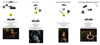
Alexandra's work is featured elsewhere in this issue but we got her to sketch her lighting arrangement for her lovely bridal portrait below.The image embodies much of what we are discussing in this feature, with gorgeous lighting on a very beautiful sitter, creating a truly magical portrait. Note the depth of the light on the shadow side of the model's face. As we have the original digital file we are able to tell you that the lightness value on the cheek graduates back from 50% to 20% in a perfectly smooth transition. It is this lighting control that gives the image much of its quality
Please Note:
There is more than one page for this Article.
You are currently on page 5
- Thoughts on low key portraiture page 1
- Thoughts on low key portraiture page 2
- Thoughts on low key portraiture page 3
- Thoughts on low key portraiture page 4
- Thoughts on low key portraiture page 5
- Thoughts on low key portraiture page 6
- Thoughts on low key portraiture page 7
1st Published 01/06/2004
last update 09/12/2022 14:56:11
More Portraiture Articles
There are 0 days to get ready for The Society of Photographers Convention and Trade Show at The Novotel London West, Hammersmith ...
which starts on Wednesday 15th January 2025


