articles/Monochrome/monomagic-page5
Monochrome Magic - part 5 of 1 2 3 4 5 6 7 8
Published 01/10/2004

Russell Brown's Mono Method
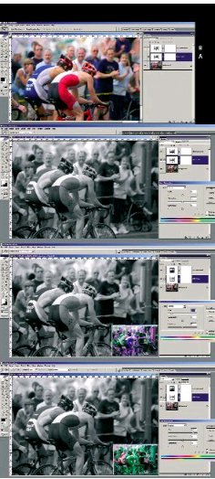
This is the method developed by Russell Brown, Adobe's Creative Director. It is regarded by many as the best way to achieve control over the transformation to monochrome. If you examine the composite screen grab below, note that adjusting the Hue has altered the balance between the monochrome densities of the riders' lycra suits.
1. Open RGB image
2. Make an Adjustment Layer for Hue/Sat/Brightness, but don't do a thing, just click OK. [A]
3. Set mode of this layer to "Colour"
4. Make another Adjustment Layer - Hue/Sat/Brightness.
[B] Move Saturation to -100 (no colour). Close this layer
5. Double click on middle Adjustment Layer (the one set to
Colour mode). Start moving the Hue slider. You can move the Sat and Lightness a bit too.
6. Fine tune effect by clicking on specific colours (eg Red) and move Hue Slider.
You'll see that you get total control over visually altering all the mix of colours, you don't have to mess with Channel Mixer and try to keep the values at 100. In addition, the above technique supports Layer Masks. When you are all done, flatten the image and print according to your chosen method.
Line 6 in particular allows massive control over the way the RGB colours map to greyscale. In the images below [1] is with the Hue slider at zero, [2] is with the Hue set to the left (ie magenta, see insert) and [3] is with the slider to the right (ie green, see insert). Dragging the slider the full distance to the left or the right creates an identical effect in each image.

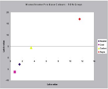
Permajet Monochrome Pro 1290
We look now at an exciting new product from Permajet, their Monochrome Pro 1290.This has been launched to suit the Epson 1290 printer but other variants are already under development. It takes the already excellent VT Blax to a yet higher level and exhibits particularly low metamerism.br>
Metamerism is a term which is frequently talked about, frequently mispronounced and ever present in some degree in all imaging situations. Two colours which match each other in one type of lighting (say daylight) but not in another (say tungsten light) are said to be a metameric pair. The difference in the colour perceived by the eye is the result of the two colour in the metameric pair being made up of a different mix of wavelengths.
The eye is most sensitive to differences in neutrals (greys) close to the mid tones. As such the observer detects and is more disturbed by lack of neutrality then many other colour defects. This is particularly so in monochrome work and sadly one of the most frequent shifts is from a warm "purple" neutral in tungsten light to an ugly olive green in daylight. This is just the colour that traditional monochrome printers have avoided when picking their toning and development conditions in silver halide printing. Ansel Adams in particular did not like any shift towards olive.
Please Note:
There is more than one page for this Article.
You are currently on page 5
- Monochrome Magic page 1
- Monochrome Magic page 2
- Monochrome Magic page 3
- Monochrome Magic page 4
- Monochrome Magic page 5
- Monochrome Magic page 6
- Monochrome Magic page 7
- Monochrome Magic page 8
1st Published 01/10/2004
last update 09/12/2022 14:56:49
More Monochrome Articles
There are 0 days to get ready for The Society of Photographers Convention and Trade Show at The Novotel London West, Hammersmith ...
which starts on Wednesday 15th January 2025


