articles/Lighting/onelightportraits-page4
One Light Portraits - part 4 of 1 2 3 4 5
by Dave Montizambert Published 01/11/2005

Frame Six
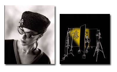
For yet another "Quick Change Background variation, the cardboard "gobo" was replaced with a tree branch full of leaves. The resulting leaf shadows create a background that looks like a sky-scape.
The beauty of this simple background system lies in the fact that the photographer's concentration and the rhythm of the shoot are not interrupted. In a matter of seconds you can provide your subject with a variety of simple backgrounds. Setting up ahead of time (placing and metering the shadows before the first subject arrives), is the trick to making this successful.
Okay cod-liver oil time, here is some of the lighting theory that makes this image work. Looking back at Frame One and Frame Two or Three, the source that lights your subject, called the Source of Illumination, is critical. Its relative size and its relative distance to the subject have a profound effect on the light quality we see on the subject - how hard or soft it appears. The Main Source of Illumination to Sylvianne in Frame One is the light head. The light head is also the Origin of the Source. It is where the energy originates. In Frame Two or Three notice how the light quality has changed by adding the panel. The light head is no longer lighting Sylvianne because the fabric blocks it. However, a lot of the light is still transmitting through the fabric (and is altered by it) onto Sylvianne. In this image the fabric is the main-source of illumination. It is the source that lights Sylvianne to her correct exposure value. The light head is the origin of that source. It is important to differentiate between source and origin because it is the actual source that affects how the light looks on your subject. Using a panel instead of a soft-box or umbrella makes it possible to separate the source from the origin. By separating origin from source allows you to create the effect of many lights with just one light and still control the brightness individually. For example, if you find that the background is not going to pure white, simply add another layer of fabric over the panel. In fact add as many layers as you need to drop the brightness on the subject relative to the brightness of the background, then increase your exposure with either aperture or shutter-speed (if you are not using strobe) to once again correctly expose the subject, which will result in an over-exposed background.
The background in the image of Sylvianne is a plus one (one stop brighter than middle grey) light grey seamless backdrop paper. If it were a white seamless paper or a white wall, it would have been even easier to create pure white on the background. Keep in mind that a white wall or a white seamless backdrop is not pure white, it is light grey and its actual value on the grey scale is about 2 stops brighter than middle grey or as I say a plus two grey. To push it to pure white you need to give it 1/3 to 1/2 a stop more brightness than what would render a correct exposure of that white surface. In fact the above method of cutting brightness to subject by adding more layers of fabric over the panel and then re-metering and resetting exposure on camera works so well that you can use it with even darker neutral surfaces and still achieve pure white backgrounds. In theory you could create a pure white background from a black backdrop. Think about it, if you give black enough over-exposure it too can be rendered as pure white. Something you should keep in mind is that when you add more layers of fabric to the main-light panel, the light on your subject will become warmer in colour balance (not a concern for B&W)
By the way, you can control the fall-off of light on the background to keep the background brightness even from edge to edge by angling the backdrop to the light origin (in this case the light head). If you are using a seamless backdrop paper supported with light stands, drag the side furthest from the light origin (the camera right side of the background in our example image of Sylvianne) towards the camera, and push the side closest to the light origin further away from the camera. This pulls the furthest side closer and pushes the nearer side of the backdrop further, resulting in even lighting across the backdrop. If you are using a wall or a fixed backdrop, set up your subject, lighting, and camera on an angle to the wall so that the wall is on the same angle relative to the camera as described above - the background's furthest side from the light origin positioned closest to the camera.
Please Note:
There is more than one page for this Article.
You are currently on page 4
- One Light Portraits page 1
- One Light Portraits page 2
- One Light Portraits page 3
- One Light Portraits page 4
- One Light Portraits page 5
1st Published 01/11/2005
last update 09/12/2022 14:57:08
More Lighting Articles
There are 0 days to get ready for The Society of Photographers Convention and Trade Show at The Novotel London West, Hammersmith ...
which starts on Wednesday 15th January 2025


