articles/Paper/permajettransrer-page1
PermaJet Digital Negative Transfer Film - part 1 of 1 2
by Mike McNamee Published 01/10/2012

The new film has been introduced to overcome some of the shortcomings of the original and to provide a serious rival to the scarce but excellent Pictorico media.
In particular the new Permajet media is very much flatter(we encountered no head strikes at all during testing) andalso has a clearer base. Other than that we were in quite newterritory and so we had to go digging in the archives and the back of cupboards to find test targets and instruments with which to do some measurements.
The workflow required to make a good digital negative is beautifully described by Lamrecht and Woodhouse in their book Way Beyond Monochrome; we have waxed lyrical about this book before. A summary of the process is as follows:
1. Prepare and manipulate a colour image in any way you choose, including montage, selective dodgingand burning along with local contrast enhancementsand filters to choice. The image is sharpened and converted to greyscale at this point although a monochrome RGB file would suffice as well.
2. Process control strips are added if measurements are required.
3. The computed transfer function is applied via a Photoshop curve. This 'corrects' the original so that a negative suitable for contact printing to Grade 2 Multigrade is obtained.
4. The image is inverted.
5. A negative is printed using the same settings as were used to create the print from which the transfer function was computed.
6. The negative is used to create a silver halide print by contact printing (or for that matter a platinum print).
Other than making the transfer function, the above is relatively straightforward.
Testing took us into the old territory of Quadrant Transfer Functions and other arcane methodologies that were oncebread and butter to the serious monochrome worker. Sadly things have been dumbed down quite a bit these days and such fundamentals are rarely taught and even lesswritten about* . Originally patented by Lloyd A Jones inthe 1940s (no relation to Phil) the system provided a wayof refining the transfer of tone through the work process, so a reasonable quality print was obtained despite all the variations along the way.
*Your editor was once told to write a book on monoprinting but no equations or graphs were allowable inthe proposed text. Hurter and Driffield would be turningin their graves; we are supposed to be professionals,experts in our field - if you can't be bothered to learn a bit of theory then take up knitting or pay somebody else to print for you!
Coming right up to date then we are seeking to make an image, adjust it (with curves) in Photoshop in theexpectation that the resulting silver halide print will be a correct interpretation of the scene. Arriving at the correctly graded starting image involves a quadrant diagram. Now although a quadrant diagram is relatively easy to draw (on a big piece of paper) the job is better done these days using a spreadsheet to calculate the way around the four squares. This is a daunting task for a non-mathematician but fortunately Lambrecht has done all the hard work, providing a target, spreadsheet and comprehensive instructions on their website www.darkroommagic.com.
In the absence of a darkroom we could only follow the process so far but at least we could get our instruments out of their dusty old boxes and let them see the light of day for the first time in decades! Gratifyingly the densitometer calibrated within a hundredth of a point right out of the old box.
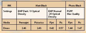
The Choice of Settings One thing we were able to explore was the settings range for inkjet printing of the digital negative - this, at least is familiar territory. The recommended choice is Photo Black ink (on the Epson) but we found the new material to be equally at home with Matt Black ink, indeed we obtained much higher Dmax in the negative with Matt Black. Both dried equally well with no hint of flooding.
In each case the media selection was Premium Glossy Photo Paper for Photo Black and Enhanced Matt Paper for Matt Black. We also explored the use of 'full colour' profile printing and use of the Advanced Black and White driver.
The data are tabled and it is obvious that there is a) scope for experimentation and b) plenty in the tank in terms of density and tone gradation.
Overall the results indicate:
1. The Pictorico and Permajet media are almost identical in response.
2. The Dmax is higher using Matt Black in the tests conducted to date, along with no obvious downsides.
3. The 'base fog' of the Permajet media is lower, ie it has a clearer, less milky base.
4. Using the Photo Black ink and a colour profile with a PGPP profile produced a weak 'print' with poor separation of the lighter parts of the film (ie the shadows in the final print). More work would result in a better quality 'negative' and there is nothing to suggest that top-class wet prints could not be made with either media. Using the ABW driver created a rapid transition of tones in the dark areas (ie the highlights in a wet print)
5. The Permajet media had a smoother transitioninto the dark parts of the film (ie the highlights of the wet print).
6. Despite our best endeavours we have done little other than scratch the surface of this topic, but at least we have proved that perseverance will almost certainly yield a really good wet print.
You are currently on page 1 Contact Mike McNamee
1st Published 01/10/2012
last update 09/12/2022 14:57:35
More Paper Articles
There are 0 days to get ready for The Society of Photographers Convention and Trade Show at The Novotel London West, Hammersmith ...
which starts on Wednesday 15th January 2025


