articles/Review/presidentpage2002-page2
The President's Page - August 2002 - part 2 of 1 2
by Terry Hansen Published 01/08/2002

Use bubble bears, rattles, bells etc. from the direction you want the child to look.
Picture 3 shows that we have moved about 5ft from the background, enabling use of a background light. We have added a hair light (a little too strong - see the shadows from the feet) and removed the shoes and socks which were dominating pictures 1 and 2. We have also turned our model slightly sideways, which has helped the pose. Picture 4 is much better. We have turned more sideways, but the added foliage is a bit overpowering and needs either cropping or, as here, vignetting down.
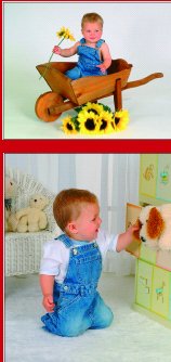
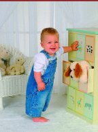
But hang on a bit - is this set-up the most appropriate for a young child and is low key not looking a big dated now? Would high key pictures be better or build a set that is lighter and brighter, with props more suited to a young child? Have a look at these other pictures, don't they look better? I have used a window set, just a simple frame set up, covered with light net curtains and put a rug on the floor. The props are more suited to a child and the pictures come together to produce a pleasing presentation. The high key set up is very simple. White Colorama paper, artificial flowers and a wheelbarrow from B & Q - airy, modern and very saleable.

So you can see just a little thought and a few pounds spent on backgrounds and props and we are producing photographs with much more appeal.
Photographs that will have a far better chance in competition and qualifying.
Please Note:
There is more than one page for this Article.
You are currently on page 2 Contact Terry Hansen
1st Published 01/08/2002
last update 09/12/2022 14:58:12
More Review Articles
There are 0 days to get ready for The Society of Photographers Convention and Trade Show at The Novotel London West, Hammersmith ...
which starts on Wednesday 15th January 2025


