articles/Business/printcompetitions-page4
Thoughts About Print Competitions - part 4 of 1 2 3 4
by Michael J. Ayers Published 01/06/2010

Top:
A memorable portrait of St. Paul's Cathedral in London with the composition running right down the middle, which technically breaks one of the compositional rules. But if you know the rules, you can break them, so not every subject needs to fall onto one of the lines that make up the rule of thirds. For this image to score well, it needs to look great under the judges' hot lights, with just enough detail in all the shadows and highlights.
Bottom:
Another concert at a holiday celebration with fireworks - this photograph is desperately in search of a centre of interest. The entire frame is filled with activity which makes a fun editorial image, but not necessarily a high-scoring print for competition.

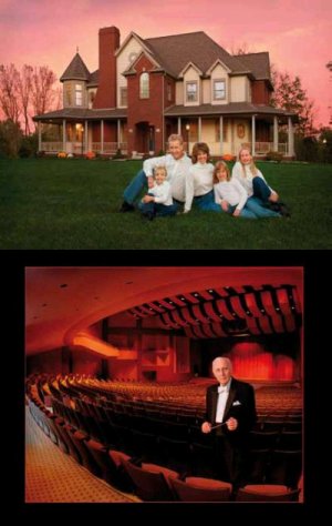
Top:
Here's a recent portrait of my family in front of our house in Ohio. Clothing has been matched and we don't have many distracting elements - also, the time of day was just perfect. Note that the subjects are placed in the fourth quadrant (lower right) which is the very best location for higher scores. Judges won't tell you that a fourth quadrant image will score higher, but it is a statistical fact.
Bottom:
This competition photograph scored 98 in competition a little more than 10 years ago. The subject is lit well, placed in the fourth quadrant amidst a great composition and location. Today, the image would be enhanced by darkening up some of the lighter areas - anything to keep the image simple and draw the viewer's eyes to the subject.
All photographs were created by Michael Ayers.
Please Note:
There is more than one page for this Article.
You are currently on page 4
- Thoughts About Print Competitions page 1
- Thoughts About Print Competitions page 2
- Thoughts About Print Competitions page 3
- Thoughts About Print Competitions page 4
1st Published 01/06/2010
last update 09/12/2022 14:58:15
More Business Articles
There are 0 days to get ready for The Society of Photographers Convention and Trade Show at The Novotel London West, Hammersmith ...
which starts on Wednesday 15th January 2025


