


articles/Digital/qualitymatters-page2
by Mike McNamee Published 01/09/2005
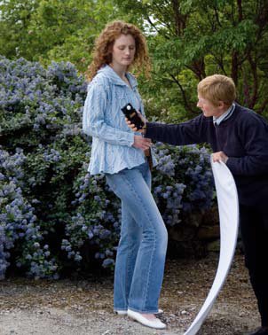
WHERE THE RUBBER HITS THE ROAD - a digital fashion shoot As part of the trials to review the Sekonic Dual Master L-558 we used it at a colour critical, knitware, fashion shoot for catalogue use. This was mainly out door in variable daylight, plus a studio shot for reference. As we had already established that the meters to hand were giving identical results, the closest assistant to the model relayed the meter reading back to the photographer for manual setting on the camera. This turned out to be quite frenzied in the everchanging dappled green sunlight (we were in a garden - the stylist's idea) and we placed Macbeth targets in as many scenes as we could, anticipating some trouble in matching the colours with so much green being reflected about. Testing after the first barrage of shots confirmed that we were getting a good match between the incident light setting and the resultant grey patch reading in Photoshop. Both RAW and JPEG shots were simultaneously recorded on the Canon 1Ds.
The difference between the JPEG shots and the RAW exposures was significant. The JPEG variants had an overall luminance which was the equivalent of 0.45 stops of overexposure. This is higher than the error band we were aiming to work within and is not the first time we have noted differences between the same exposure transferred to different file formats.
File Format Average Image Luminance
JPEG 108.76
RAW to sRGB 87.99
RAW to ARGB 91.65
It makes a nonsense of the idea trying to pin exposures to 1/3rd of a stop if you wish to mix JPEGs and Raw in the same shoot and reinforces the writer's view that RAW is the only game in town if quality is what you are after. These sorts of discoveries are the things that drive people back to film! In the absence of impeccable experimental technique some of them go un-noticed, other than the user being dissatisfied with the variations that they are seeing.
HOW GREAT IS THE SHOT-TO-SHOT
VARIATION? We also needed to know how much variation was being introduced by the variations in shutter speed and aperture of the lens, just in case that was responsible for any exposure variation. The photographs examined were shot in a little under two minutes at the same exposure settings. The average scene luminance in the image rose from around 110 points to 115 points as the photographer moved slightly closer to the model. However the shot-to-shot variation was of the order of 1or 2 luminance points (on an 8-bit 0 to 255 scale) compared with the 21 point variation between JPEG and RAW. When the model and photographer remained stationary the luminance varied from 122.09 to 122.76 points, a minuscule shift of 0.7 points. For these tests, with this camera, variation cannot be blamed on the Canon 1Ds, it is almost flawless!
In summary, exposure with an incident light-meter produced very consistent luminance in the actual image and no significant variation was seen in the mechanics of the camera.
The JPEG signal processing, however, raises serious concerns for those who are chasing the ultimate in out-of-the-camera consistency.
GRETAGMACBETH COLOR CHECKER SG Most readers will be familiar with the 24 swatch Macbeth Color Checker. For those who are not it was proposed by McCamy, Marcus and Davidson in 1976 as an aid to calibrating and assessing film and TV camera systems.
The colours of the CC24 represent two tone levels of human skin, sky blue, foliage "bluebell blue" and a bunch of other colours evenly spread around the colour gamut. The charts are accurately manufactured, under controlled conditions, using special formulations of pigments. This is what makes them relatively expensive.
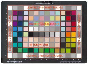
A couple of years ago, GretagMacbeth attempted to add to their line-up with a 267 Swatch, DC Color Checker, intended to service the burgeoning use of digital cameras. This soon fell into disrepute as it contained some shiny patches, which extended the gamut at the expense of abnormal behaviour under certain types of polarised lighting conditions. It has now been discontinued. Its replacement is the subject of this review.
The CCSG has 96 coloured and neutral swatches in its centre, surrounded by 44 neutrals arranged in white, mid-grey and black triplets. The purpose of the outer ring of patches is to assess the evenness of lighting in a scene. Within the central cluster of colours are those of the CC24, a new set of 14 skin tones, and an additional 6 neutrals which extend deeper into full black and fill in the gaps in the CC24 set. The target is 8.5"x11" to suit most camera formats reasonably well. The second batch of charts we examined was made from a much sturdier plastic, front and back, rather than the earlier version's card. We have found the card to be unstable in outdoor sunlight, causing buckling and separation of the leaves.
There are 0 days to get ready for The Society of Photographers Convention and Trade Show at The Novotel London West, Hammersmith ...
which starts on Wednesday 15th January 2025


SWPP - Society of Wedding and Portrait Photographers
The Society of Photographers
Clwyd Chambers, Clwyd Street, Rhyl, Denbighshire, LL18 3LA, UK
Tel 00 44 (0) 1745 356935
Home Page - Find a Photographer - Benefits of Membership - Events and Seminars - Who's who - Photographic Trade Directory - About - Qualification Structure - Mentor Me Programme - Professional Imagemaker Magazine Articles - FREE information pack - Privacy