articles/Lighting/swood-page1
Stuart Wood Lighitng Masterclass - part 1 of 1
by Stuart Wood Published 01/10/2013

If I could describe my work and what I love most about it in one word, that word would probably be 'variety'!
I do realise how lucky I am to have a job that involves visiting some amazing locations and meeting so many interesting people.
Whether I am the 'stills' photographer on set of a TV drama, taking sensitive images for one of my charity clients or photographing a wedding at a high-end venue, it is always different. In the years that I have been shooting professionally, I have worked both overseas and in virtually every part of the country from the far north of Scotland to the south coast and just about every place in between, including Buckingham Palace!
Another common element that runs through all my work is that I almost never get a chance to visit the location prior to the shoot and have therefore had to get pretty good over the years at making the most of a location and finding images when I am there.
This, of course, does not prevent me from thinking about the sorts of images that I want to get when I am first given the brief and the image that I am going to describe in this article is a good example of such forward planning and then, somewhat unusually, actually finding exactly what I was looking for when I eventually arrived at the location.
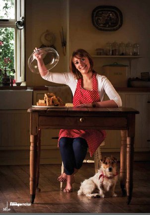
The image was a commission for BBC Olive Magazine and it was part of a featured article looking at people who left their previous jobs to work in the food industry. I knew that this particular case study was about a lady that produced amazing cakes, biscuits and flapjacks while being based in a rural farmhouse in Northumberland. The idea that I had already worked out in my head before arriving was, hopefully, to be able to portray the rustic farmhouse kitchen feel in the background of the image, while adding a very lively and engaging foreground.
When we arrived, I asked if I could look around and I eventually 'found' my image, which not only meant shooting through the doorway of another room, but with the help of my assistant, also meant 'shifting' some of the furniture which included an incredibly old and heavy chest of drawers and all of its contents!

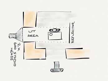
What I loved about this location was the massively thick walls (no doubt to dull the effect of many a long and cold northern winter) and to the left of frame was such a wall with a doorway, which, as a result of the thickness of the wall, created a passageway to the next room. I knew that if I lit the 'passageway' from the other side of the doorway, the light would channel through in such a way that it would have virtually no effect on the background while lighting my foreground perfectly from left to right. I knew that if I lit it carefully, I could almost make it look like an outside door had been opened, letting in daylight from the left.
The real trick with supplementary lighting of any kind is to make it look so natural as to leave the viewer unaware that the image is actually lit.
So to get my 'open door' lighting, I placed two Elinchrom 600 heads with a metre-square soft box on each and had one head covering the top half of the doorway and the other covering the bottom and to give it the natural feel and, knowing that I needed to light a little dog under the table, each was set to identical power.
The other reason for doing this was that due to our old friend, the 'inverse square law' rendering the nearest object to the light source brighter, we needed the small area of floor to the left to look vivid enough to resemble the natural way that daylight would shine straight down from the sky and through our 'open door' and lighten that part of the floor.
To the right of the subject I placed the gold/silver side of my large California Sunbounce reflector.
The table was adjusted perfectly to sit exactly in the path of my 'channelled' light and the all important flapjacks were placed to the left of the table, so that they were lit perfectly and there was no danger of stray and unwanted shadows ruining their appearance on the page of the food magazine. To balance the image and to introduce a dynamic diagonal into the picture, the dog was placed to the bottom right of the table with the girl's arm raising the dish towards the top left of the frame. The image was deliberately composed for the portrait format, as it was going to be used full bleed on the magazine page.
A slight bit of bright window was left in the top left of frame, but away from the main subject, so as to reinforce the idea of natural light coming from left of frame.
After our desired aperture was achieved to render the background slightly 'soft', the ambient light was then carefully controlled with the shutter speed and by selecting a slightly faster shutter speed, I was able to 'shade down' the ambient light to around a stop under the main light, which really made the subjects in the foreground stand out by creating an almost 3D like effect.
The client absolutely loved the image and did use it full page in the magazine ... and yes the flapjacks were wonderful too!
You are currently on page 1 Contact Stuart Wood
1st Published 01/10/2013
last update 09/12/2022 14:59:27
More Lighting Articles
There are 0 days to get ready for The Society of Photographers Convention and Trade Show at The Novotel London West, Hammersmith ...
which starts on Wednesday 15th January 2025


