articles/Monitors/absolutecalibrationp1-page2
Absolute Calibration Part 1 - part 2 of 1 2 3
by Mike McNamee Published 01/06/2002

Monitor Calibration
There are a number of matters to attend to in order to make the screen look like the anticipated output print. For starters you should be viewing the print in the correct light (normally a daylight corrected D50 or D65 illumination). These are two standard illumination colours, which are similar to daylight. Tungsten light is quite yellow (equivalent to "D" 35) with a colour temperature of 3500°K. D50 has an equivalent of 5000°K and D65 is equivalent to 6500°K. Thus D65 is bluer than D50 but warmer than 9500°K. For reference, D75 is "Northern Skylight" and most flash guns pump out at a claimed colour of 5500°K.
The standard level of "office" illumination is 200Lux. Most people don't have Lux meters but if you take an incident exposure reading from where you sit at your computer you are looking for somewhere in the region of 1s at f8.0 for an ISO 100 film speed.
In any event, the reading from your room and screen should be within about 1 EV of each other. If colour is really critical to you consider a proper viewing set-up as provided by the likes of DW Viewboxes, who will also advise you on various illumination solutions that they can provide.

Next, the colours on your computer desktop should be neutral grey. You may like to spice up your surroundings with wild screen "Appearance" colours but they will only serve to bias your judgement of colour (towards the complementary of the background). Similarly, the surrounding environment should ideally be grey but we recognise that if you are forced to operate in a domestic or semi-domestic environment this might be difficult to obtain authority for!
Having sorted your surroundings you may now turn your attention to your screen-graphic card combination. The least expensive method is effectively free - it is called Adobe Gamma and comes bundled with Photoshop. Programs such as CorelDRAW come with their own variants, as do some scanner software bundles. With these methods you are invited to make a patch in the centre of a coloured square match the colour of this surrounding square. The process is at best difficult, at worst near impossible, although it is better than nothing. The next step up is to substitute a gizmo for your squinting eyes and get that to look at the colour coming out of the screen. This removes the problems associated with our variable eyes and should in theory provide an ideal solution. We tried the Heidelberg (which came bundled with CorelDRAW 9), the X-Rite Monitor Optimzer and the ColorVision Spider.
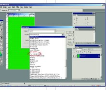
All three work in roughly the same way. The software plays a set of colours onto the screen and the gizmo measures them. The software then creates an "icc" profile which PhotoShop recognises and offers as an option for your set-up. The newly created profile may be set as the "default" either from the software, or, if this is not an option, you can go and set it yourself:
Please Note:
There is more than one page for this Article.
You are currently on page 2
- Absolute Calibration Part 1 page 1
- Absolute Calibration Part 1 page 2
- Absolute Calibration Part 1 page 3
1st Published 01/06/2002
last update 09/12/2022 14:50:44
More Monitors Articles
There are 0 days to get ready for The Society of Photographers Convention and Trade Show at The Novotel London West, Hammersmith ...
which starts on Wednesday 15th January 2025


