articles/Weddings/adobealbumdesign-page6
Using Adobe Creative Suite for Album Design - part 6 of 1 2 3 4 5 6 7
by Tom Lee Published 01/10/2009

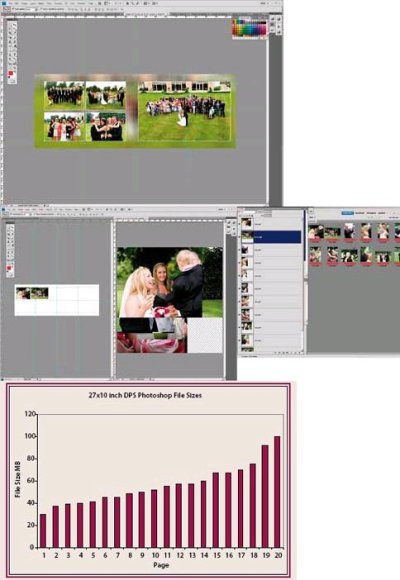
This screen grab shows Tom Lee's simple guides placement. Tom prefers a minimum of constraint from his templates.
Real Album Design
In order to get a deeper understanding of designing albums for real we consulted Mark Ashworth who uses InDesign in his studio for album creation, the actual work being carried out by his wife Kirsty; Tom Lee, who uses Photoshop; Jane Briscoe-Price who uses Photoshop and finally Chris Morris who uses InDesign. The number of designers using InDesign for album making is small, although it is used in-house by GraphiStudios (we understand this represents about 100 InDesign 'seats').
Mark Ashworth's philosophy can be summarised easily. They prefer a simple style of album and do not exploit any of the higher-end features of InDesign. Having used InDesign previously for publication literature, they prefer the simplicity of image placement and pdf output, and core skills were already in place.
Tom Lee uses Photoshop and we were able to give him a detailed debriefing, using a full set of real wedding files. Tom has thought his workflow through very carefully and refined repeat tasks with shortcut actions, activated by single or double key strokes. His albums are prepared by GraphiStudios although he has tried a number of other providers including Blurb.
Sinead and David's Wedding
For this wedding Tom generated a total of 16.8GB of files. This comprised a total of 2,446 files of which 641 were RAW file originals and 20 were finished, double-page spreads (DPS) which were eventually uploaded to GraphiStudios. The final album pages were in JPEG format and totalled 58MB. The Photoshop files from which the album pages were generated were 1.14 GB, ie about 20 times larger. The page size was nominally 27 inches by 10 inches at 250ppi giving a basic Adobe RGB file size of 49MB per page. Depending upon the number of layers and their content, the individual DPS page files ranged from 30 to 100MB. Opening all the DPS files gave a Photoshop scratch file usage of 6.71GB out of 12.9GB available on our workstation - we do not recommend opening the lot for an ordinary computer!

Workflow
Tom's workflow (and interested parties should note that he is scheduled to talk about this and album design at the Convention) is as follows.
He starts by working through the RAW files, deleting any 'no-hopers' and mentally assembling groups of shots that tell a sub-plot of his story for placement in a DPS. The RAW files are colour corrected, cropped and adjusted as Tom imagines how they will be on his page (and this can include conversion to mono, glamour glow, etc). For each page he will identify the 'key' image which sets the tone of the page both in terms of colour and style (eg formal, free-style, casual, etc). A blank DPS template file is opened followed by all the files intended for that page. Each individual file is then brought onto the template DPS, placed and scaled using a combination of set guides and (more lately) Smart Guides. Tom likes the freedom of not being boxed in by too many guides on a template. Once the arrangement is complete, a backdrop file is selected, placed at the bottom of the layer stack and then expanded to fit all or part of the DPS. This backdrop may then be, blurred, made partially transparent, toned, gradient masked or combinations of all these effects (some shots may have been taken in camera with backdrops in mind eg very shallow depth of field). At this stage Tom looks at each image to make a final check for tonal balance and sharpness, using the normal tonal adjustment tools of Photoshop and shortcuts for incrementally Smart Sharpening.
This tonal adjustment stage is a key benefit of compiling pages in Photoshop. The individual image is being assessed alongside its companions and against its real backdrop without leaving Photoshop. Additionally the image is being viewed in a colour-managed environment including soft-proofing should you wish. By choosing an image from the page-set to act as a backdrop, Tom ensures at least one level of colour harmony. Once Tom is happy with the page, key lines are added using shortcut actions for different weights and colours.
For this example album, Tom completed the design in four to five hours (split) so a good working average would be 15 minutes per DPS album page. It is difficult to imagine gaining any time on this by using InDesign and the enforced pauses while waiting for files to open act as 'thinking time while he works. Despite our growing scepticism we carried on with our exploration from an InDesign perspective.
Please Note:
There is more than one page for this Article.
You are currently on page 6
- Using Adobe Creative Suite for Album Design page 1
- Using Adobe Creative Suite for Album Design page 2
- Using Adobe Creative Suite for Album Design page 3
- Using Adobe Creative Suite for Album Design page 4
- Using Adobe Creative Suite for Album Design page 5
- Using Adobe Creative Suite for Album Design page 6
- Using Adobe Creative Suite for Album Design page 7
1st Published 01/10/2009
last update 09/12/2022 14:50:50
More Weddings Articles
There are 0 days to get ready for The Society of Photographers Convention and Trade Show at The Novotel London West, Hammersmith ...
which starts on Wednesday 15th January 2025


