articles/Paper/canvasoptions-page4
Paper Chase - Canvas options - part 4 of 1 2 3 4 5 6 7
by Mike McNamee Published 01/08/2004
Testing the Media
Media Testing We followed the overall scheme set out in the first part of Paper Chase. he test printer was an Epson 7600 loaded with Matte Black ink. Each material was profiled using Monaco Profiler and an X-Rite DTP 41, set to reject fluorescence and match the greys to the base white of the paper. A 17 bit, 729-swatch target was made at 1440dpi and Textured Fine Art Paper as the media choice. Super X dithering was set to "on" but we left "Finest Detail" off to prevent system hangs (more of that another time). A perceptual rendering intent was specified.
An audit target was then made using the bespoke profile and the data analysed and collated. In addition to this, separate measurements were made using a DTP 22 X-Rite Digital Swatch Book for black density and the spectral power distribution of the base paper. Each canvas was then photographed under glancing light at about 4x fill size so that the coating structure and the weave characteristic could be shown. Framed
Finally coating trials were carried out to test the water resistance of the coating. The prints were assessed visually in D65 lighting conditions and under ultra violet light.
The Base Whites
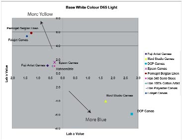
The base white tone controls the overall perception of the finished image. There are special ways for measuring the white of paper but these were not followed in this review - we do not have the equipment. We limited ourselves to checking for optical brighteners and measuring the base reflectance and colour. These are presented graphically and vary widely - all tastes are catered for! It was noted that the highlight tones were not as well differentiated when printed on all canvas medias. This is an optical effect because the very fine patterning of the 3 or 4% ink, at that level of highlight, is obscured by the patterning of the weave. The wedding specialists might like to think about getting a bit more ink into the highlights if they wish to show more detail in a bride's dress. In his own experiments, Tom Lee reports that he is also adding a touch of additional saturation to his low key images intended for canvas printing.

The Ilford and DCP canvasses stand out as being the coolest. The Permajet and the Folajet are the most cream. The Epson is a more neutral cream and the others are all closer to neutral.
The DCP and Ilford materials stood out as being bluer and brighter than their peers, indeed the lift at the 430nm wavelengths took both papers over 100% reflectance. Both these canvasses produce a cool bright image, essentially a more modern look. The other media were in the yellow/cream part of the spectrum, the Permajet Belgian Linen standing out as by far the most creamy and traditional looking. The Fuji Hunt Artist Canvas, the Hahnemuhle products had close to identical SPD's. They certainly do not have the same properties in other areas of the analysis but may be an identical mix of filler.
Other than for colour, the look and feel of the canvas is governed by weave structure and the type of thread. They behave differently under the scalpel (all are quite tough to cut in fact) and had different flexibilities and stretchiness. Difficult to quantify even if it is easy to feel the difference! We show pictures and attempt to describe these characteristics with each separate report.
Please Note:
There is more than one page for this Article.
You are currently on page 4
- Paper Chase - Canvas options page 1
- Paper Chase - Canvas options page 2
- Paper Chase - Canvas options page 3
- Paper Chase - Canvas options page 4
- Paper Chase - Canvas options page 5
- Paper Chase - Canvas options page 6
- Paper Chase - Canvas options page 7
1st Published 01/08/2004
last update 09/12/2022 14:52:14
More Paper Articles
There are 0 days to get ready for The Society of Photographers Convention and Trade Show at The Novotel London West, Hammersmith ...
which starts on Wednesday 15th January 2025


