articles/Qualifications/cdprint-page1
Qualification Panels - To submit CD or print - that is the question! - part 1 of 1 2
by Michelle Whitmore Published 01/06/2013

With the 2013 Societies' Convention now a distant blur, it's time to look forward to next January and turn our thoughts to the 2014 Big L Challenge.
I enjoy watching panels being judged and have picked up lots of snippets over the past few years but time and time again I'm amazed at the basic errors and lack of care and attention when presenting finished images. My intention here is to provide a few hints and tips to add a little polish to your final presentation to increase the WOW impact. I will also discuss the pros and cons of a CD submission versus a printed presentation; and look at success rates of each type of presentation from past Big L Challenges to see if the results are more favourable for one form over the other or if there is no difference.
Qualification Overview:
The requirements for each level are well documented so I won't go into full details here but at a glance the basic requirements are:
Submissions for Licentiateship and Associateship:
• Submissions will be accepted digitally or in a printed format.
• For a digital submission please prepare the images as JPEGs, 2000 pixels on the longest side and numbered 1-20.
• For a printed submission please prepare the images in 20x16 inches on foamboard-mounted prints (L is 10x8 inch).
• Each submission MUST include a contact sheet of all images which must be numbered as '21'.
Submissions for Fellowship:
• Submissions will only be accepted in mounted print format.
• Please prepare the images in 20x16 inch foamboard mounted prints.

• You must also include a CD of images as jpgs 2000 pixels on the longest side and numbered 1-20.
Choosing your panel images:
So, you've decided to raise your game and accept the Big L Challenge.
You've spent the lovely summer months photographing your images and now need to select the ones you want to use in your panel.
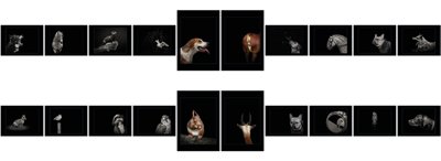
The aim of a qualification panel is to show off your style and skills using 20 images to form a complete body of work. Each image will be assessed in its own right but it is also how the image sits within the panel that is also taken into consideration. The panel must sit together and flow to be a successful, cohesive body of work.
There are a few things to take into consideration when putting your panel together:
• Colour or Mono: The consensus of most judges is DO NOT mix the panel; stick with either colour or mono. There have been occasions where mixed panels have passed but to avoid uncertainty stick with one type. And then she shows her own panel which is mixed!!
• Processing techniques: If you use processing techniques try to stick with the same technique on all images. A panel with several processes applied will look messy and hinder the flow of the panel.
• Image rotation: There are no hard and fast rules on this one but the point to remember is how the panel will look when presented, particularly a printed panel. A panel will look odd if it has 19 landscape images and one portrait image indiscriminately plonked anywhere on the top row; it would be far better to have two either in the middle or one at the beginning and one at the end to indicate the start and finish of the panel. I suppose you could say it's all about creating balancing patterns that are pleasing on the eye and enhance the presentation of the panel.
• Image position: It's best to start and end a panel row with images facing inwards with forward facing images placed in the middle of the panel.
• Images that are predominantly red should be central as the eye is automatically drawn to them, placing them at the beginning or end or a row draws the eye away from the rest of the panel.
• Crop: Again there are no rules on crop but if you have included for example a letterbox crop try to include two to keep the panel balanced.
• Gold images: Whilst it's nice to have gold images in the panel, it doesn't make the panel an automatic pass. The panel has to sit together as a complete body of work so if 90% of the panel is in colour then to include a mono, just because it was awarded gold, will look odd and unbalance the panel.
• Stick to the criteria of the panel: For example if you are submitting a portrait panel of people, ensure you have sufficient images to fulfil the requirements, do not throw in a couple of pet portraits or bridal portraits to make up the numbers as mixed panels will be disqualified!
What are the submission options?
The next step is to think about how you're going to present your panel.
The two options available to you are via a CD submission or a printed panel; each has their own advantages and disadvantages and the choice is entirely yours, unless you're going for your Fellowship in which case the panel has to be printed.
You are currently on page 1
- Qualification Panels - To submit CD or print - that is the question! page 1
- Qualification Panels - To submit CD or print - that is the question! page 2
1st Published 01/06/2013
last update 09/12/2022 14:52:20
More Qualifications Articles
There are 0 days to get ready for The Society of Photographers Convention and Trade Show at The Novotel London West, Hammersmith ...
which starts on Wednesday 15th January 2025


