articles/Qualifications/cdprint-page2
Qualification Panels - To submit CD or print - that is the question! - part 2 of 1 2
by Michelle Whitmore Published 01/06/2013

CD:
Advantages: Easy to put together; very low cost to produce, can be sent in the post.
Disadvantages: Images can look distorted on a screen ; loss of colour (although most screens used by the panels are at least sRGB gamut, mine is bigger than ARGB! Ed); no overall view of the panel so potentially a loss of impact; easy to submit without proper care and consideration.
Printed panel:
Advantages: Instant visual impact.
Disadvantages: High presentation cost; highlights poor printing, can be a pain to put together.
Making the most of your chosen form of presentation:
Judges also look at presentation as well as the images and marks are awarded accordingly. They can also be deducted for poor or sloppy presentation so it's worth spending a little time and effort to make sure you get those marks, after all it could be the difference between a pass and a fail.
Listed are some simple practices to give you a good foundation to work from:
Hints and tips for a CD submission:
• Present the images on a background.
• Keep the background the same size and colour throughout.
• It's advisable to keep the images all the same size; if you do opt for the odd letterbox style crop try to balance the panel further along with another letterbox crop to maintain consistency.
• Add a key-line to all the images it ties the image to the border a bit like a mounted frame does; keep the key-line the same size and colour on all images; ensure the key-line is applied to all images, missing some out can make a panel look messy.
• A large projected image will show up more faults than a printed image would. This is quite simply untrue, the best screen only go to around 1,600 pixels!
Hints and Tips for a printed panel:
When a judge walks into the judging room it will be the first time they will see your panel. As we all know first impressions count so the first thing to do is make sure your panel stands out. Make them want to know more about your images; make them want to go and have a closer look. Give it as much of the WOW factor as you can.
• Unless you are a competent printer, use a professional print lab.
• If you insist on printing your own use the same type of throughout; it is inadvisable to have a panel of mixed papers so keep it either gloss, satin or matt.
• The same as a CD submission it's advisable to keep the images all the same size; if you do opt for the odd letterbox style crop try to balance the panel further along with another letterbox crop to maintain consistency.
• Go for quality over size, larger prints may show faults in either the printing or the image that may not be so obvious in a smaller print. Be aware though that at Fellowship level it is a requirement that the prints are of impeccable quality, if it won't go large because of underlying quality issues it is unlikely to be of pass standard.

• Use properly matted mounts to show off your images and not a single print stuck on foam-board. It's all about showing off your images to the highest standard and making that little extra effort speaks volumes about the creator.
CD v Print?
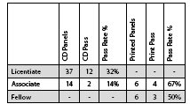
I guess the next question is 'Is there a significant difference in the way panels are presented and the pass rates for each type?' I think the following figures will show the answer is most definitely YES.
FACT: The number of printed panels submitted is a lot less than CD submissions but the success rate is far superior.
When I first saw these figures I was a little surprised that there had been no printed submissions at the Licentiate level but then it dawned on me that perhaps because there is an assumption that the CD submission is an easy option so not as much preparation and attention to detail was given to the finished panel or whether it was due to lack of information on how to present a panel or simply lack of confidence and inexperience. Whatever the reasons, CD submissions result in a lower pass rate; it's worth noting that this is common with the other associations too, not just The Societies.* * Many people who have become accustomed to working with screen-sized images (and in some instances receiving feedback about these small images) are shocked to find that their work has insufficient quality to survive expansion to a 16x20 inch mounted print. The requirement for print submissions at Licentiateship level is for 10x8 inch mounted images.
I hope this article has provided an insight into a number of ways to improve your panel and gain those extra presentation points. I personally think the pass rate figures speak for themselves but I'll leave it for you to decide on how you present your panel in 2014, but I know what I'll be doing - see you in London.
Please Note:
There is more than one page for this Article.
You are currently on page 2
- Qualification Panels - To submit CD or print - that is the question! page 1
- Qualification Panels - To submit CD or print - that is the question! page 2
1st Published 01/06/2013
last update 09/12/2022 14:52:21
More Qualifications Articles
There are 0 days to get ready for The Society of Photographers Convention and Trade Show at The Novotel London West, Hammersmith ...
which starts on Wednesday 15th January 2025


