


articles/Printers/epsonrstuylusprok3-page4
by Mike McNamee Published
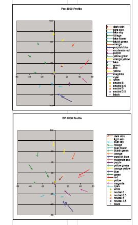
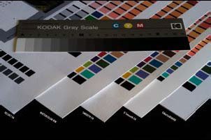
ABOVE 1: The Pro version of the Epson profiles out-performs the SP version as indicated by the relative lengths of the error lines. ABOVE 2: A macro image showing the surface textures of the art papers.
We made audit test prints in full colour and with the Advanced Black and White drivers, using the Epson 4800 using Matte Black ink and the SP 4800 EVFA MK 2880.icm profile at 2880dpi. The A3+ printed in 13m5s with the High Speed (Bilateral printing) turned off. The mono image we printed with -10 on Brightness and +7 on Contrast in the driver. The resulting mono image was truly gorgeous - a joy to behold!
In terms of colour precision the Velvet returned an average error across the Macbeth colours of 4.3 Lab ÄE/ 2.7 ÄE 2000. The skin tones were about 2 half° too yellow with the saturation being near perfectly accurate. The Dmax was greater than the UltraSmooth Fine Art at 1.63 (16.74% brightness). The greyscale linearity of the combination was noteworthy, one of the best we have seen for an art paper, delightfully smooth right down the tone scale. Metamerism was very slightly higher than other media at around 1.8 maximum, falling either side as previously discussed.
The preliminary data from Wilhelm Institute indicated lives behind glass of 62 years for the Velvet/K3 combination, rising to 166 years when Premier Art Spray is applied.
Watercolour Paper - Radiant White
This is a 190gsm paper with a finer texture than Velvet. It is 28 microns thick, a little light for some tastes. In the Wilhelm testing on the 9800, the Watercolour fared better than the Velvet with a projected life, under glass, of 118 years. The SP profile for this combination did not work as well as the other in the test and so we also included the Pro profile. There was an ugly kink in the tone response with the SP profile between 25 and 30 RGB points and a slight veiling in the ¼ tones. As the table below shows, the Pro profile was a significant improvement and illustrates the benefit of experimenting (and not assuming that new must be better!). It is difficult to guess why there should have been a difference. From the Pro profile the skin tones were rotated about 1½° towards yellow and desaturated by about 5% at the richer end of the tone range.
There are 0 days to get ready for The Society of Photographers Convention and Trade Show at The Novotel London West, Hammersmith ...
which starts on Wednesday 15th January 2025


SWPP - Society of Wedding and Portrait Photographers
The Society of Photographers
Clwyd Chambers, Clwyd Street, Rhyl, Denbighshire, LL18 3LA, UK
Tel 00 44 (0) 1745 356935
Home Page - Find a Photographer - Benefits of Membership - Events and Seminars - Who's who - Photographic Trade Directory - About - Qualification Structure - Mentor Me Programme - Professional Imagemaker Magazine Articles - FREE information pack - Privacy