articles/Paper/layingtrail-page2
Paper Chase - Laying the Trail - part 2 of 1 2 3 4 5 6 7 8 9 10
by Mike McNamee Published 01/04/2004

Testing methods
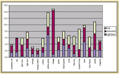
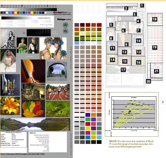
Since the first Paper Chase our testing methods have improved. Without going into all the whys and wherefores, we use the latest and most sophisticated of the error measurement parameters, the so called Delta E 2000. This has been developed by the ICC (International Colour Consortium) and its advantage is that the error values are adjusted to most closely match the way the eye perceives differences. So, for example, we are very sensitive to variations in neutral greys and the measure reflects this sensitivity. We are not as sensitive to variations in the bright blues and again the measure reflects this.We now have three ways of examining test prints:1. Controlled Colour Light booth (by eye)2. An X-Rite DTP 22 Digital Swatchbook3. An X-Rite DTP 41 Strip Reader.In the light booth we can view in D65 and D50 conditions; we also have ultra violet lighting, and tungsten. As a final check we can take the print to the window and use good old-fashioned daylight!It is the X-Rite DTP 41, which has revolutionised the way and depth at which we examine print colour quality. We have written computer code, which enables us to stream the spectrographic data right into a spread sheet and instantly perform magic sums to generate dozens of graphs which characterise the way the paper/printer/profile combination is working. The target we use is reproduced in this feature and is also available for download at www.colouraudit.com as an A4 sized RGB (1998) JPEG file. The target has a number of images and test targets as well as spectro swatches on the right hand strips. The origin of each image is annotated with the reproduction of the target later in this feature.

Testing - the Human Touch
In spite of the sophistication of our colour analysis it is still vital to have a human examine the finished test print. This sometimes throws up surprises, both good and bad. Prints with poor statistical data can sometimes look quite good and vice versa. Skin tones, for example are intolerant of contamination with green. Dark tones are quite tolerant of big shifts in hue simply because we can't see them in a dark colour. At the other end of the scale a shift in a mid tone grey will be instantly picked up by any normal-visioned observer. We had a fine example of the need to fully look over the prints and data recently when testing an experimental paper. Everything looked quite good in the photographs but the statistics for the greens looked very dodgy. Examining the profile we had built also showed a large "bite" out of the gamut. We eventually isolated the problem to a blocked nozzle set - there was no cyan at all coming through. The profile build had done quite a good job of accommodating the lack of cyan and so the print looked half decent. After things had been fully corrected the resulting print was superb! The moral of the story is that you have to look carefully at your test print and consider each bit of the test image in turn. That is why our statistical analysis pulls out the average values but then flags the larger error readings so we can go and check them out individually and make sure that they are legitimate. A flaw in a piece of paper, although rare, will play havoc with a spectro reading.
Please Note:
There is more than one page for this Article.
You are currently on page 2
- Paper Chase - Laying the Trail page 1
- Paper Chase - Laying the Trail page 2
- Paper Chase - Laying the Trail page 3
- Paper Chase - Laying the Trail page 4
- Paper Chase - Laying the Trail page 5
- Paper Chase - Laying the Trail page 6
- Paper Chase - Laying the Trail page 7
- Paper Chase - Laying the Trail page 8
- Paper Chase - Laying the Trail page 9
- Paper Chase - Laying the Trail page 10
1st Published 01/04/2004
last update 09/12/2022 14:55:39
More Paper Articles
There are 0 days to get ready for The Society of Photographers Convention and Trade Show at The Novotel London West, Hammersmith ...
which starts on Wednesday 15th January 2025


