articles/Lighting/makingamonte-page1
Making a 'Monte' by Monte Zucker - part 1 of 1 2 3
Published 01/06/2005

So, what IS a "Monte Portrait"
It's simple, direct, uncomplicated It has impact!
My philosophy in my work: I don't photograph the world as it is. I photograph it as I want it to be. So, yes, I'm incurably romantic. I confess.
These portraits were created within the last 25-30 years. Most of them were created digitally within the last year or two. Some were created in the "olden" days before digital. These images are exactly as they appear in a new book of mine that was published recently by PictoBooks, (info@pictolab.com) The original book is 15x15 inches. It's available in the full size and in a smaller 5x5 version by contacting them. Most of the images are printed on metallic paper. Incredible to see and hold!
I gave the files to PictoBooks and they designed the entire setup. Each page carries my message with it. The photographs are displayed with good taste and not a lot of digital effects that take away from the images, themselves. It's difficult for some to lay off of the many gimmicks that are available now in digital printing. My hat is off to PictoBooks for preserving the dignity of my work.
Let's go back in time....

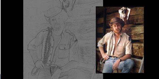
Over 30 years ago I made this picture under the eaves of the rooftop of a barn. I had no idea then that this was to be the beginning of a style that I later developed for outdoor portraiture - that is, keeping the subject under cover to get directional light. The idea of placing it page-right with the graphics of the image to the left was completely generated by PictoBook's resident artists. The outline of the photograph was created in Photoshop by going Filter/Stylize/Find Edges and changed to black and white.
I often strengthen the lighting ratio on men's portraits. It seems that a higher contrast in men's portraits makes the men appear stronger, more forceful.
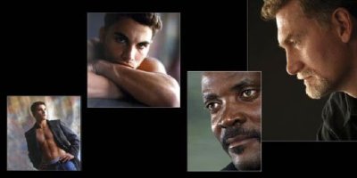
The strong lighting in the black man's portrait was accomplished by split lighting his face with one light, placing the camera where it saw the 2/3rd view of his face and keeping the main light in its normal position (at a 45° angle to the front of his face). A fill light (behind the camera) is 2 f/stops less than the main light on his face.
The other three portraits were lit by window light. I was careful to preserve detail throughout the images...from the brightest highlight down to the deepest shadows. I did it digitally by exposing for the highlights and bringing up the shadows with a reflector.
The next page, reproduced here, is a combination of the old and the new. The smaller portraits were created in my film era, too. The soft focus was done with an Imagon lens. I was never able to duplicate that same effect until I found Canon's 135mm soft focus lens. With this lens I can again create whatever degree of softness I want by changing the f/ stops. Both of these portraits were created with the same basic Photogenic lighting system that I'm still using today (Photogenic Photo Master PM08 - 800 watt power pack with 4 lights coming out of it). It's difficult to light two faces when they're going in opposite directions, so the lighting has to be fairly centred on the two of them.
I had my light camera-right, as both of the brides have their faces turned in that direction. The larger high-key profile of the bride was created outdoors under cover, too. She was standing at the edge of a covered porch.
You are currently on page 1
- Making a 'Monte' by Monte Zucker page 1
- Making a 'Monte' by Monte Zucker page 2
- Making a 'Monte' by Monte Zucker page 3
1st Published 01/06/2005
last update 09/12/2022 14:56:18
More Lighting Articles
There are 0 days to get ready for The Society of Photographers Convention and Trade Show at The Novotel London West, Hammersmith ...
which starts on Wednesday 15th January 2025


