articles/Lighting/makingamonte-page2
Making a 'Monte' by Monte Zucker - part 2 of 1 2 3
Published 01/06/2005

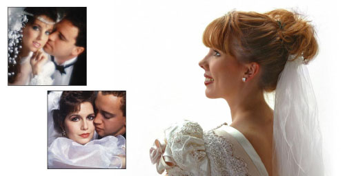
The background is Westcott's translucent foldout 4x6' panel. She was turned to get the natural profile lighting on her face. A silver reflector (Westcott's Monte's Illuminator) helped to open up the shadows. I exposed by using Aperture Priority on my Canon 10D (at that time). When I'm photographing into a brightly lit background like this the camera usually stops down a little too much, so I first let the camera pick its own settings and then override the f/stop if necessary.
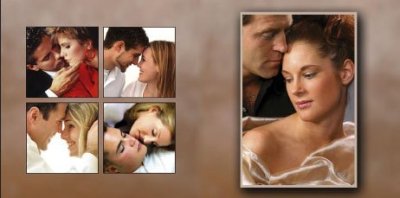
What's there is what I want you to see. Everything else has been left out. Whether square (Hasselblad, film-based era) or rectangular (I'm using Canon's 20D now for everything that I do). I usually crop in the viewfinder. The background for these pictures is a small selection from the fabric that was draped around the woman in the larger image. The selection is then stretched in Photoshop through Edit/Free Transform to cover the entire page and the other photographs are then layered on top of it. It was almost like cheating when I photographed these models for the Canon D30 ad. It was my first professional digital camera. The reason that I say it was cheating is that there was a complete bank of ceiling-to-floor windows to my left. Large translucent panels that created an effect that you would get from north-light windows covered them. White ceiling, walls and floor bounced the light everywhere. Still the main light was coming from my left. An additional wall of windows was at each end of the commercial studio. They were covered by shear curtains that were taped to the walls.
The photographs were made in New York City with the help of Clay Blackmore and about 25 assistants walking around the studio. They were there to take care of the clothes, the hair, the make-up, the accessories, the kids and me! What a fabulous experience. None of these pictures was selected for the ad, but they gave me lots of practice.
To keep the mirror from reflecting the studio background I positioned large white panels on wheels so that they were the only things that showed in the mirror. I removed the edges of the panels in Photoshop.

No, it's not cheating working with ambient light. One just needs to know how to put it to use. You need to know where it is, how to harness it and create lighting situations that create the "look" that you desire. The picture of the bride with the flowers beneath her chin has become one of my signature pictures. A window behind her created the highlights on the left side of her face. Another window behind me was the fill light. That's all there was to it. The profile of the bride was created in the same way as the previous high-key profile. The shadows in the background of the page were the actual shadows of tree leaves behind the translucent panel when I took her picture.
What do you see when you look at this page of full-length brides? The answer: Brides! Gowns! Not necessarily a lot of landscape. Why don't I do a lot of pictures outdoors in pretty gardens? Because I like to work in controlled lighting situations with simple backgrounds that ADD to the composition rather than distract. In my opinion many photographers go out into the open areas because they feel that they don't have to worry about lighting. In fact, however, it's MUCH easier to work as I do.
Let's now look at some of the illustrations on this page of my book. Notice, by the way, that although there are many images on this two-page spread, there is nothing in the arrangement to take your eye away from the subjects. The layout is simple. It displays the images just the way I want them to be seen.
For the couple with the stained glass window behind them I exposed for the window and matched my Quantum digital flash to the exposure of the window. A wide-angle lens with the couple up close to the camera made them stand out and the window be just background to them.
The bride with the HUUUUGGGGEEE train was photographed under cover at the National Cathedral, Washington, DC. All natural light. A part of the back of her gown is the background for the whole double-page spread.
The bride in the living room was exposed for the ambient light in the room. I took the cover off my Quantum flash and used it bare-bulb at 1 1/2 stops below the ambient light. With Quantum's digital attachment to my camera you can dial in how much flash you want to use and set it from 3 stops below the ambient light to 3 stops over. What did I ever do without it? I know. Polaroids. Lots of them. It's never been this easy
The back profile of the bride was created with all natural light coming in under the porch rooftop. I positioned the camera to keep a simple background behind her profile.
All together the page says, "Brides!" The backgrounds are all there, but the brides still are the center of attention, aren't they!
Please Note:
There is more than one page for this Article.
You are currently on page 2
- Making a 'Monte' by Monte Zucker page 1
- Making a 'Monte' by Monte Zucker page 2
- Making a 'Monte' by Monte Zucker page 3
1st Published 01/06/2005
last update 09/12/2022 14:56:18
More Lighting Articles
There are 0 days to get ready for The Society of Photographers Convention and Trade Show at The Novotel London West, Hammersmith ...
which starts on Wednesday 15th January 2025


