articles/Monochrome/themonochromeissue-page2
The Monochrome Issue - The Output Options - part 2 of 1 2 3 4 5 6 7
by Mile McNamee Published 01/04/2006

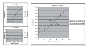
The graph, above left, shows the non-linear Lab response to RGB values. The pair below show the effect of changing the media setting while keeping everything else the same. The maximum black is reached with less ink for the Premium Glossy Photo Paper 250 than for say the Smooth Fine Art setting. The space between values is from 10% to 35%, quite a large difference. In practice this is to account for the art paper needing more ink before it becomes saturated.
Correct profiling will account for these differences but it shows the importance of keeping to the same media setting between profile-making and usage. The graphs also show why you can make changes to your print density by deliberately using different media settings, something that you might try from a position of knowledge, rather than guessing!
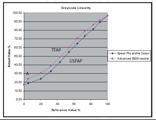
One of the outcomes of this linearity (or lack of it) is that you may have to make additional corrections to your image after you have adjusted it to taste on your monitor. Experience teaches that the most unreliable aspect of monitor calibration is the mismatch between the grey levels shining out of the (transmissive) monitor and off the (reflective) print - they ain't the same thing!
The best tactic is to print out an RGB grey step scale, note the effect, in a print, using your preferred conditions and then develop a curve to true it up. This curve can then be applied before printing a monochrome. If you own profile editing software you could adjust your profile to take account of the effect.

As well as the media setting chosen for a print, the resolution also affects the density of the print. This rises progressively as the resolution is increased from, for example, 360dpi to 2880dpi. The graph (top) indicates about a 3% difference between 360dpi and 2880dpi when everything else is kept the same. The Dmax rises from 2.04 to 2.27 as shown in the table. These differences are smaller than the effect of the media setting.
Tonal Neutrality
The base tone of the print should be colour neutral or at least controllable for a warm or cool tone. The new Epson Advanced Black and White driver offers a superb way of controlling this effect. However you could use some of the techniques describe previously to either add a desired tone or even correct for an undesirable one.
Tonal Cross-over
When all the colours of an ink-jet printer are used, the underlying base tone colour of the 'neutral' should not waver along the tone scale from black to white. This can occur because of a poor profile or a variation due to coloured inks being substituted, in varying proportions, with black and grey inks. Variations in the ¾ tones and above are particularly noticeable.
In the example shown below, the lower quadrants of the Lab plot are shown. Pure neutral is marked with the white square. The print from an un-profiled ink-jet printer starts off slightly blue, the colour of the base of the paper. As the greys become darker, the tone bias moves 'south', ie more and more blue, until it peaks at the near-black, before returning towards more neutral for the true black.
Plots such as these come in all shapes and sizes from unprofiled printers attempting to create monochrome, sometimes wandering back and forward across the neutral point, sometimes visiting every variation of tone bias. This example is quite strongly blue-biased - a good profile would keep the grey neutrality within a Lab point of the paper base - notionally shown by the red ellipse. Metamerism may also vary as different proportions of the coloured inks are mixed onto the print.
Please Note:
There is more than one page for this Article.
You are currently on page 2
- The Monochrome Issue - The Output Options page 1
- The Monochrome Issue - The Output Options page 2
- The Monochrome Issue - The Output Options page 3
- The Monochrome Issue - The Output Options page 4
- The Monochrome Issue - The Output Options page 5
- The Monochrome Issue - The Output Options page 6
- The Monochrome Issue - The Output Options page 7
1st Published 01/04/2006
last update 09/12/2022 14:59:43
More Monochrome Articles
There are 0 days to get ready for The Society of Photographers Convention and Trade Show at The Novotel London West, Hammersmith ...
which starts on Wednesday 15th January 2025


