


articles/Paper/cansoninfinity-page2
by Mike McNamee Published 01/06/2009
The Fine Art papers
These should be chosen for the task in hand when reproducing fine art,. You need to understand real art surfaces if you wish to match the surface used in the 'media technique' you are reproducing. Alternatively, if you are simply creating digital prints from photographs, by all means go with whatever you feel is sympathetic to your image.
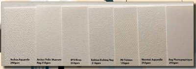
These papers are all natural white (slightly creamy actually) with no OBAs and acid free. Some paper weights go beyond the 250gsm demanded by Fine Art Trade Guild for limited-edition printing. Some are mould-made off a traditional felt roller, which imparts its own unique characteristic to almost every sheet. Some of the surfaces appear to be 'chain laid'. For this 'chains' of wire are woven into the felt to generate a repeating surface pattern - this is most obvious in Mi-Teintes.
Our macro photographs deliberately enhance the surface texture using lowangle lighting so that you can judge the surface better. Different people will have different preferences (thank goodness!). For example your reviewer is not a fan of Mi-Teintes with its obvious diamond patterning. This type of paper is ordinarily used for pastel work in which the texture of the paper interacts with the chalk - you either like pastel or don't!. These are important reasons to buy the 'Discovery Pack' so that you can at least see the surfaces for real.
Printing
We have to hold our hands up here, we allowed ourselves to be confused by the identical screen grabs for all setting instructions and chose Velvet Fine Art Paper for the media choice. The correct choices are set out on page 7 of the Canson Infinity website instructions, none of them call up VFAP! With only a single sheet of each paper we were unable to recover our error after Canson had pointed it out to us.
For the record the settings we used were as follows for allthe test sheets:
Printer Epson 3800
Ink Set OEM K3
Ink Type Mk
Media Velvet FineArt paper
High Speed Off
Microweave On
Resolution 2880dpi
BPC On
Rendering Intent Perceptual
Profile Relevant one from website
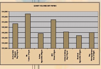
It was an interesting exercise to use the same (but incorrect) settings for a range of papers and compare the results. We arranged the papers according to various, visually-judged parameters, before we conducted our audit measurements, to see how well we could do. The parameters we chose were: gamut volume, highlight separation, shadow openness, skin tone accuracy and overall density. Overall we did reasonably well, but were not as good as our spectrophotometer. For example we picked out the two high-gamut results and the three lowest, but mixed up the middle ones. We correctly picked out a red bias in the skin tones of Edition Etching and Montval. We picked the density variations in the correct order with just a couple of switches (the variation in the mid-grey ran from 49.6% to 56.1% Lab Lightness reading). We failed to correlate the Dmax values but were reasonably successful on placing the prints in order by the openness of the shadows. It was an interesting exercise but we would not bet the housekeeping money on ourselves!
There are 0 days to get ready for The Society of Photographers Convention and Trade Show at The Novotel London West, Hammersmith ...
which starts on Wednesday 15th January 2025


SWPP - Society of Wedding and Portrait Photographers
The Society of Photographers
Clwyd Chambers, Clwyd Street, Rhyl, Denbighshire, LL18 3LA, UK
Tel 00 44 (0) 1745 356935
Home Page - Find a Photographer - Benefits of Membership - Events and Seminars - Who's who - Photographic Trade Directory - About - Qualification Structure - Mentor Me Programme - Professional Imagemaker Magazine Articles - FREE information pack - Privacy