articles/Digital/colourcorrection-page2
Colour Correction - part 2 of 1 2 3 4 5
by Mike McNamee Published 01/09/2006
If you are colour-blind or colour defective there are certain occupations that you are barred from. You won't be much use in a photographic laboratory, an electronics company or as a police officer. The first is obvious, the second is because you would mix up all those wires and the third is because the judge will want a better description of the getaway car than "it was a reddy, greeny-grey colour".
Assuming you are not a colour defective, i.e. something biologically wrong such as a missing pigment, how do you measure up when judging colour? This is an important question because experience tells us that some people seem to be better at judging colour than others. We spoke to one of the UK's leading experts in this subject, Jennifer Birch of the City University. In her book on the subject she says, "...most people with normal colour vision can acquire superior colourmatching skills if they are sufficiently motivated." Certainly in the tests conducted on my Photoshop students over the years, only two have failed the Farnsworth D15 colour discrimination test, the main difference between people is the speed at which they do the test, not whether they get the correct answers.
This is encouraging for those who worry that they have poorer colour vision than their peers, but there is no doubt that some people seem to have better judgement than others, the trick is to learn from our peers who are judged good at it. Colour discrimination goes off with time away from the job; you need to break yourself back in after a long holiday or time off work! The problem is two-fold for the colour printer - deciding which way the colour is out and then how to make it right! The advice that filters through seems to be consistent; train yourself up, learn from a more experienced colleague and, lastly, don't give up. It might also pay to visit the site at http://www.geocities. com/heartland/8833/coloureye.html and test your colour vision. If you find that you are colour-blind take up monochrome photography or try harder!
Here are some general pointers:
1. The eye is quite discriminating over colour - watch that you don't end up chasing an impossible standard.
2. The trained eye is even more discriminating, better than many instruments.
3. Practice improves performance.
4. Learning alongside a skilled practitioner is useful.
5. Viewing conditions are important and include:
- sufficient illumination
- correct light colour
- correct surrounding colours (don't have jazzy wallpaper!)
- no glare, especially on your monitor
6. Differentiating cyans is the hardest task.
7. The size of the block of colour exaggerates its colour. A small piece of off-colour grey might look OK in a colour print, that same bias on a 16x12 monochrome print will look way out.
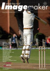
8. The colours surrounding the colour under examination exert a big influence. We had a classic example on the front cover of the issue before last. Look at the SWPP/BPPA logo shown as normal and how we had to distort it to make it "correct" on the cover. At its correct Pantone value, the BPPA was almost invisible against the model's arm. This is where colour by numbers really breaks down, we arrived at the adjusted colour of the logo purely by eye, there is a 21 delta E difference between the colours (we'll explain delta E later!).
Please Note:
There is more than one page for this Article.
You are currently on page 2
- Colour Correction page 1
- Colour Correction page 2
- Colour Correction page 3
- Colour Correction page 4
- Colour Correction page 5
1st Published 01/09/2006
last update 09/12/2022 14:52:39
More Digital Articles
There are 0 days to get ready for The Society of Photographers Convention and Trade Show at The Novotel London West, Hammersmith ...
which starts on Wednesday 15th January 2025


