articles/Digital/colourcorrection-page3
Colour Correction - part 3 of 1 2 3 4 5
by Mike McNamee Published 01/09/2006
We can use the list above to guide our behaviour when making colour judgement. In general terms you should rely on your female partner, wife, sister, etc to assist you. As well as two brains being better than one, if you call them in late in the process they will not have been sitting there accumulating eye strain and colour bias, a process known as chromatic adaptation. Also you should take a break from your labours before making a final decision on the colour balance of your image, your first judgement is most likely to be correct and this includes your first impression after a break. Also you should take your time and while this goes against the advice in the last sentence to some extent it is a fact that only experienced colourists are able to make fast judgements.
Another trick you can employ to assist is to highlight the numerical adjustment values in a Photoshop dialogue box (by double clicking them to make them show blue). Now, when you hold the shift key down and click on the up or down arrows, the values jump by 10 units, producing a rapid shift in colour. If you move without the shift key the values jump one digit and you might have adapted to the shift by the time you get 10 clicks in. By jumping in big increments you can do a Goldilock's Porridge adjustment (i.e. - this one is too big; this one is too small; this one is just right!).
A final word before we get into the nuts and bolts of adjusting colour. Do not waste your time chasing perfection in your greys from older, six-colour ink jet printers - you will never get there if you are very discriminating. The latest Ultrachrome K3 ink sets will satisfy 99% of even fanatical photographers and 100% of normal punters. Bespoke profiling in general will get the job done with most printer and ink combinations although metamerism may still rear its head with some ink sets.

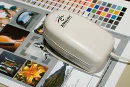
The X-Rite Digital Swatchbook is one of the most popular measuring instruments. It measures single colours but can also average a series of readings, indispensible if you have to match to the colour of a garment or even a brick!
Measuring Colour
This series of articles is planned to be a reasonably complete explanation of the topic and we must therefore set the scene with some care. We have so far explained how colour is perceived, now we need to explain how it is measured. We have to understand the relationship between measuring and correcting colour so we know where to put our effort in.
Providing you have either a colourimeter or a spectrophotometer, measuring colour is simple. You simply place the image on a flat surface, plonk the instrument onto the relevant bit of the image and press the measure button. The instrument then sends the colour values to your computer or to its own little screen. It is from here that things get complicated! There are literally dozens of ways of expressing the colour values. This is a bit like currency. A jar of coffee may cost £3.45, $5.1 or €5.48. The coffee in your shopping trolley does not change but the numbers it costs vary according to how you are going to pay for it. Colour is the same. The colour in the image stays the same but the numbers (currency) you use to describe its value vary according to how you measure it.
Please Note:
There is more than one page for this Article.
You are currently on page 3
- Colour Correction page 1
- Colour Correction page 2
- Colour Correction page 3
- Colour Correction page 4
- Colour Correction page 5
1st Published 01/09/2006
last update 09/12/2022 14:52:39
More Digital Articles
There are 0 days to get ready for The Society of Photographers Convention and Trade Show at The Novotel London West, Hammersmith ...
which starts on Wednesday 15th January 2025


