articles/Paper/permajet-fb-range-page1
Paper Chase - The New Permajet FB Range - part 1 of 1 2 3 4
by Mike McNamee Published 01/10/2015

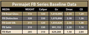
Permajet have had a long-standing tradition ofexcellent papers in a range to cover every applicationthat comes to mind. After a review of usage andconsumer preferences, they have refined their rangeto bring together the most sought after propertiesin a rationalisation that retains some of the products,tweaks others and lets some go from the catalogue.Thus they have the new FB range which consists of:
FB Royal Gloss
FB Distinction
FB Gold Silk
FB Satin
FB Matt
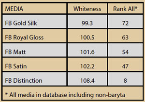
The five provide a range of basic properties such asbrightness, base tone, surface finish and OBA content.All paper selections are a user compromise - youcan't have a bright paper and an absence of OBAs forexample! For this reason we have listed the papersand place them in position in our database of manyhundreds of paper tests which includes both barytaand non-baryta media.
We have chosen to treat each paper as brand new, ie notused previous profiles or data, although we did take apeek a legacy readings (for the purposes of training youunderstand).

Monochromes
Air-dried fibre-based media was once the sole province ofmonochrome with iconic papers such as Ilford Galerie andAgfa Record Rapid. Thus this look is now in vogue. Goodmonochromes depend upon clean greys, low metamerism,high Dmax and good gradation along the grey ramp thatdifferentiates shadows and highlights.
All the media passed this test with flying colours (sorry aboutthe pun!). In all instances the highlights were differentiatedout to 252 RGB points and the shadows down to 20 points.
The perceived tone of the monochrome depends upon howwell centred the middle of the tone range is upon the basetone of the paper. A cool paper will have cool highlightsas the base of the paper predominates. The value of solidblack Epson K3 ink in almost neutral so the grey ramp driftstowards that neutral and away from the base coolness of abrightened paper. This is a fact of life but is not normally anissue.
Warm-tone monochromes should be printed to FB Gold Silkso that the natural warmth of the paper compliments theink tone. This seems at odds at first sight because the papersurface actually reads as neutral. However, spectrally neutraltones appear slightly warm in most light.
You are currently on page 1
- Paper Chase - The New Permajet FB Range page 1
- Paper Chase - The New Permajet FB Range page 2
- Paper Chase - The New Permajet FB Range page 3
- Paper Chase - The New Permajet FB Range page 4
1st Published 01/10/2015
last update 09/12/2022 14:57:33
More Paper Articles
There are 0 days to get ready for The Society of Photographers Convention and Trade Show at The Novotel London West, Hammersmith ...
which starts on Wednesday 15th January 2025


