articles/Monochrome/themonochromeissueintro-page3
The Monochrome Issue - Introduction - part 3 of 1 2 3 4 5 6 7
by Mile McNamee Published 01/04/2006

The list does not include dodges such as running a print through the printer a number of times (yes, people do).
A Matter of Conversion
Assuming that you have a starting image that is RGB (the most likely, from a camera at least) then the following is a discussion on your options for converting to a monochrome image, ahead of printing. We were unsure at first if there were any differences between various methods and devised some tests to get our bearings - and very instructive it proved to be. Some methods produce identical results, some do not, some create artefacts, some do not - so read on!
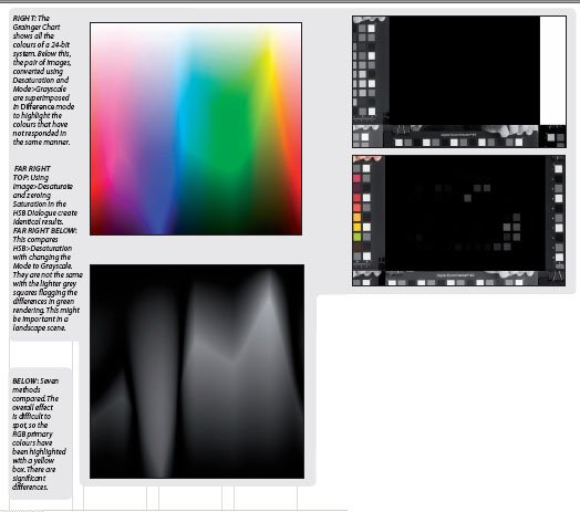
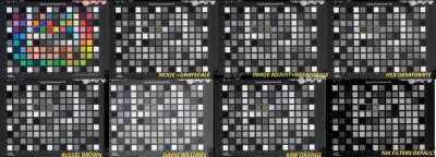
To test the various methods we took an RGB image of a Macbeth SG chart (in Adobe RGB colour space) and duplicated it about 10 times. Each duplicate image was then converted by different methods into greyscale. To compare two methods we simply dragged one image into a layer, above the other, and turned the top layer to Difference mode. Then, any differences in the translation into grey scale, show up as variations in tone.
By way of example a Grainger plot is shown in colour and then with two images, superimposed in difference mode, one converted using Mode>Grayscale and the other using Image>Desaturate. If the mono-conversions were identical we would have ended up with a black square (ie extinction) - we did not. The lower image shows a comparison between the identical results of desaturating in the Hue-Saturation-Brightness dialogue and the different results, comparing HSB-Desaturation with Mode- Convert to Grayscale.
We also noted that some methods produced discontinuous artefacts at the boundaries between the black of the Macbeth chart borders and the solid patches of colour. These are reported in each relevant section.

Overall the preliminary tests showed that there are significant differences between methods, which explains why there are so many variations between different users, each of whom may have their own preference. The lesson is that you should explore all the possibilities that are different and base your decision on the method you like the look of. The artefacts are a different issue and if you find that they show in your image then try a different method - again this will be image dependent, influenced by the relative mix of colours that you start with.
Please Note:
There is more than one page for this Article.
You are currently on page 3
- The Monochrome Issue - Introduction page 1
- The Monochrome Issue - Introduction page 2
- The Monochrome Issue - Introduction page 3
- The Monochrome Issue - Introduction page 4
- The Monochrome Issue - Introduction page 5
- The Monochrome Issue - Introduction page 6
- The Monochrome Issue - Introduction page 7
1st Published 01/04/2006
last update 09/12/2022 14:59:44
More Monochrome Articles
There are 0 days to get ready for The Society of Photographers Convention and Trade Show at The Novotel London West, Hammersmith ...
which starts on Wednesday 15th January 2025


