articles/Software/adobe841-page7
Adobe Camera Raw 8.4.1 - part 7 of 1 2 3 4 5 6 7
by Mike McNamee Published 01/08/2014

he Workflow
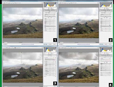
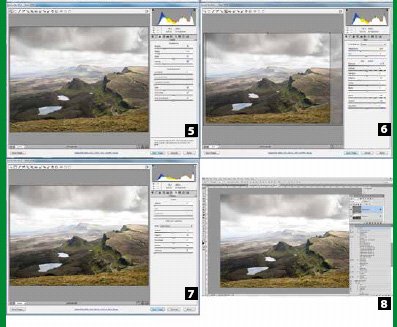
Although it matters little to the eventual outcome, it is preferable to follow a set routine when adjusting images. Starting at the top and working your way down the sliders is a common approach. Either way, the clipping warnings should be switched on and watched as 'exposure' adjustments are made; this at least removes some of the pitfalls of screen calibration. It is normal to adjust the Exposure slider first and then tweak the Highlights if this is created clipping. Changing Saturation and sometimes the Vibrance slider can also drive tones into clipping as can sharpening. In the example shown here this was the method followed:
1. The image was opened as shot.
2. The white balance was judged to be OK but to improve the dynamic range the exposure was increased by +0.25 and the blacks were depressed (ie made blacker) by 53 units. The sky did not clip anywhere and the black clipping, just visible behind a single rock, was ignored.

3. With the Linear Gradient tool dragged down to the tops of the near ridge, the exposure was dropped by -0.8 units - a purely visual assessment to darken the sky.
4. To rebalance the overall effect the Exposure was adjusted to +0.35, the shadows backed off to -44. To some extent this was to counteract the effects of the +40 Clarity and +45 Vibrance, used simply to enhance the presence of the image.
5. Sharpening of Amount 40; Radius 0.9; and Detail 50 were added and then the Masking was set to protect the sky from over-sharpening.
6. The composition was adjusted to taste with the Cropping Tool.
7. Lens Vignetting was applied to 'hold' the edges of the image in.
8. The Pixel Genius High Pass sharpening for an inkjet print was added, using an action.
Please Note:
There is more than one page for this Article.
You are currently on page 7
- Adobe Camera Raw 8.4.1 page 1
- Adobe Camera Raw 8.4.1 page 2
- Adobe Camera Raw 8.4.1 page 3
- Adobe Camera Raw 8.4.1 page 4
- Adobe Camera Raw 8.4.1 page 5
- Adobe Camera Raw 8.4.1 page 6
- Adobe Camera Raw 8.4.1 page 7
1st Published 01/08/2014
last update 09/12/2022 14:50:49
More Software Articles
There are 0 days to get ready for The Society of Photographers Convention and Trade Show at The Novotel London West, Hammersmith ...
which starts on Wednesday 15th January 2025


